T.O.P Mall x Wade and Leta - From New York to Hong Kong

Client T.O.P (This is Our Place) Hong Kong
Year 2021
Scope Campaign Graphics, Installation Design, Inflatables, Sculpture, Construction
Production KASHow
Installation Photography Wax Leung Photography
Models Deanna Leigh
Year 2021
Scope Campaign Graphics, Installation Design, Inflatables, Sculpture, Construction
Production KASHow
Installation Photography Wax Leung Photography
Models Deanna Leigh
A little of New York in Hong Kong.
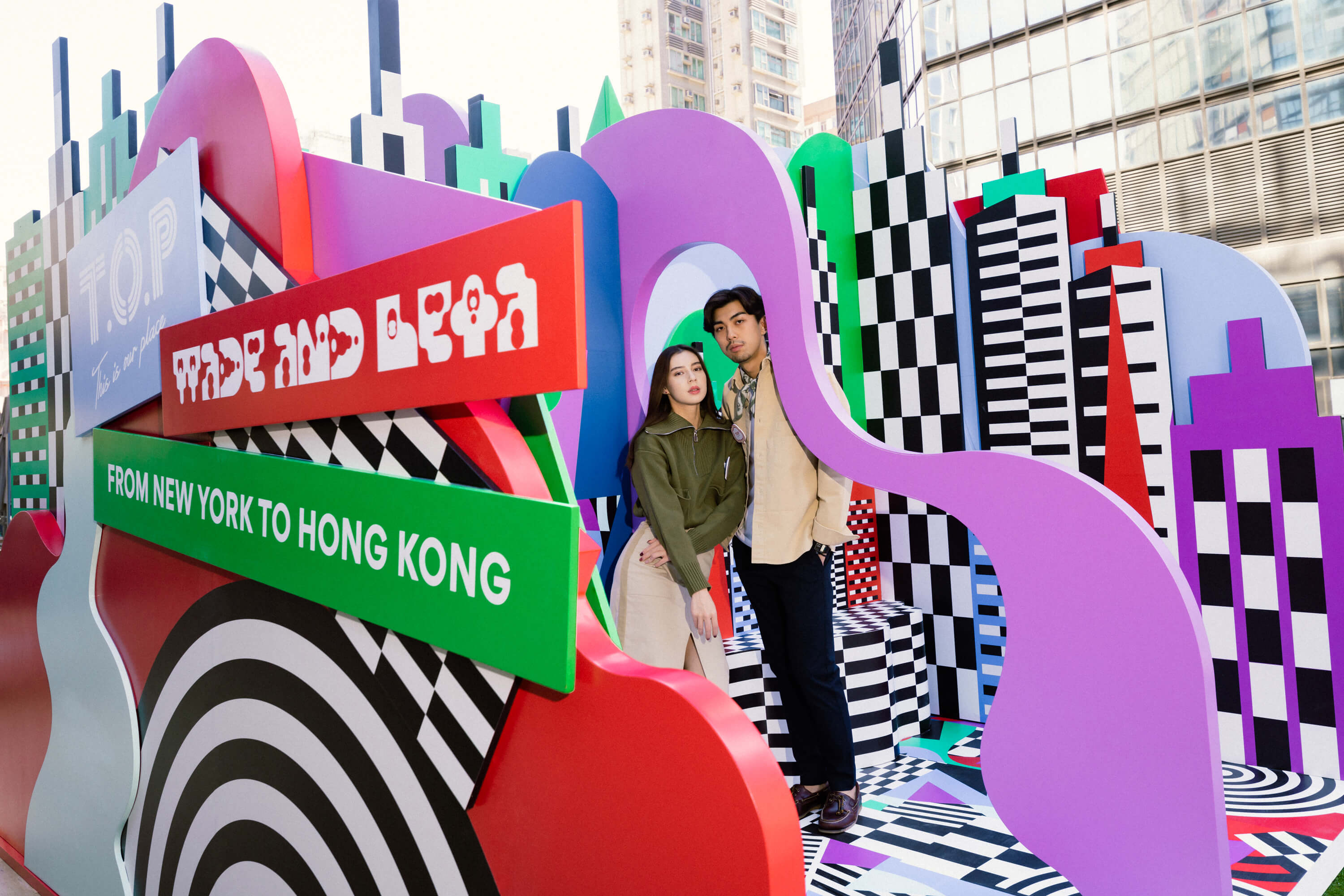
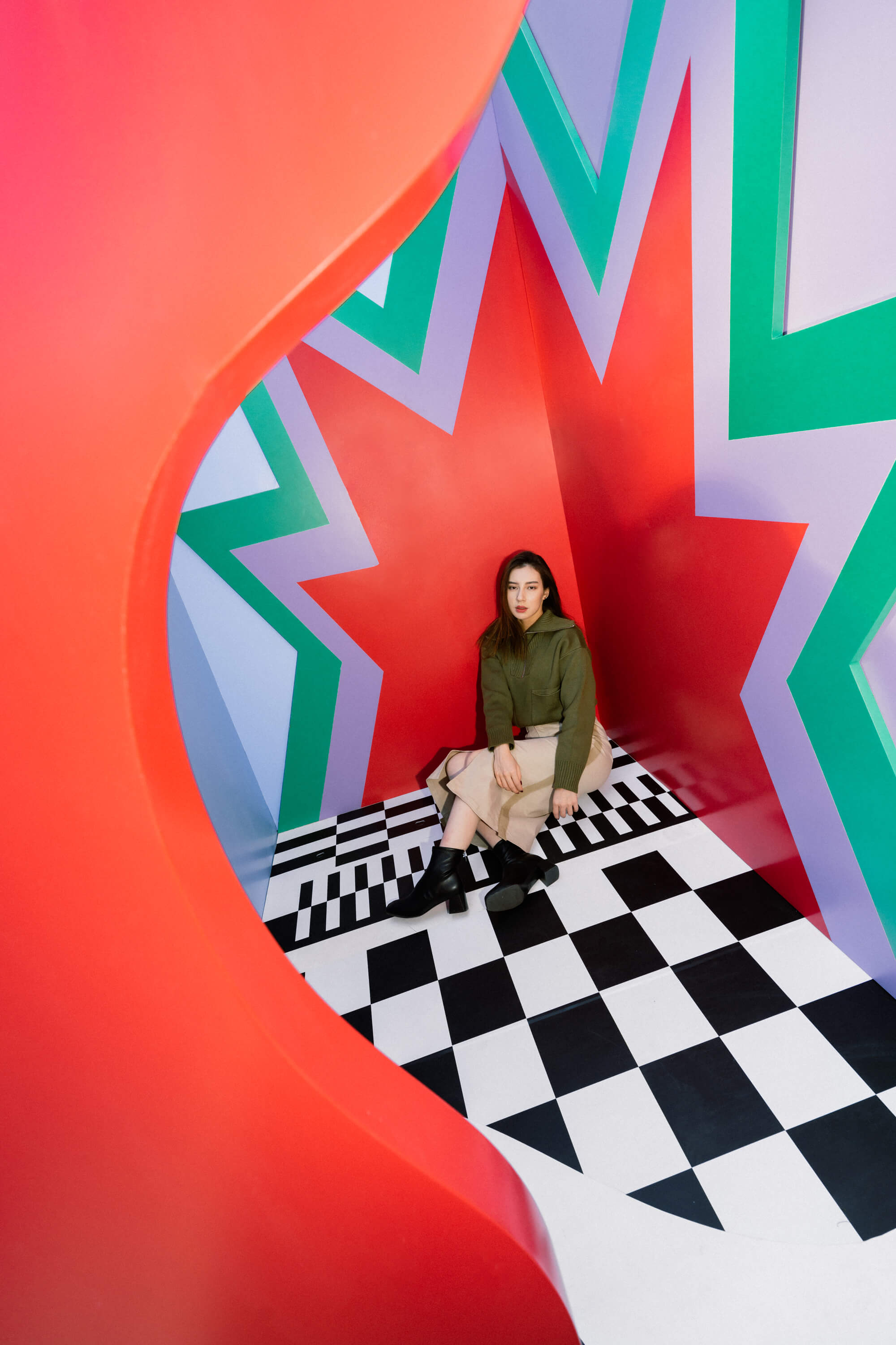
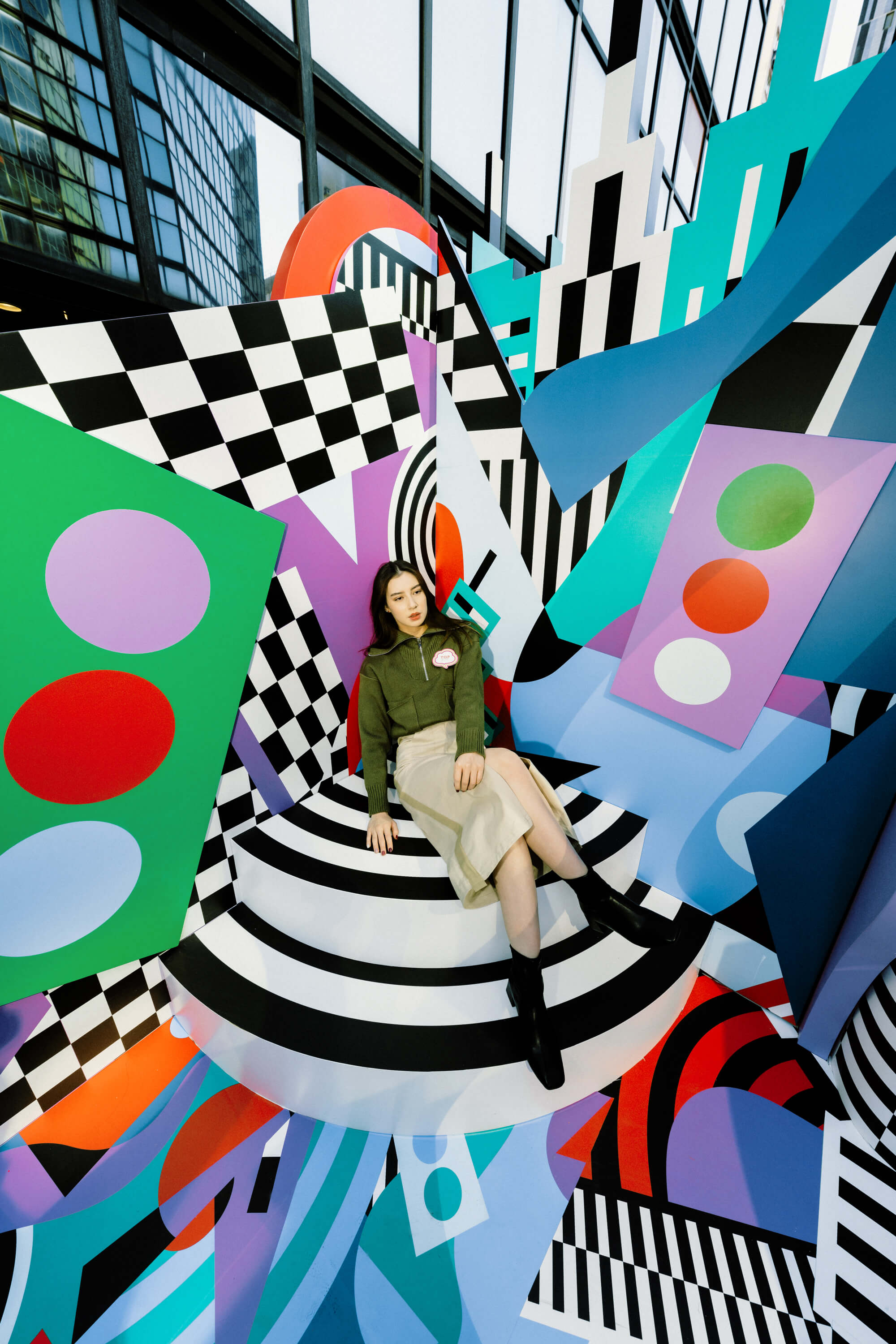
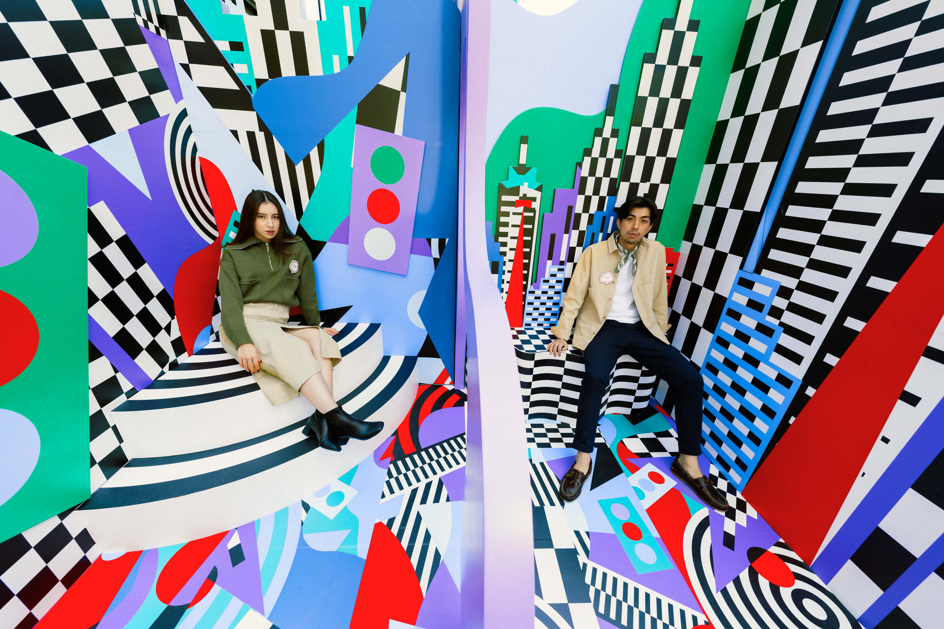
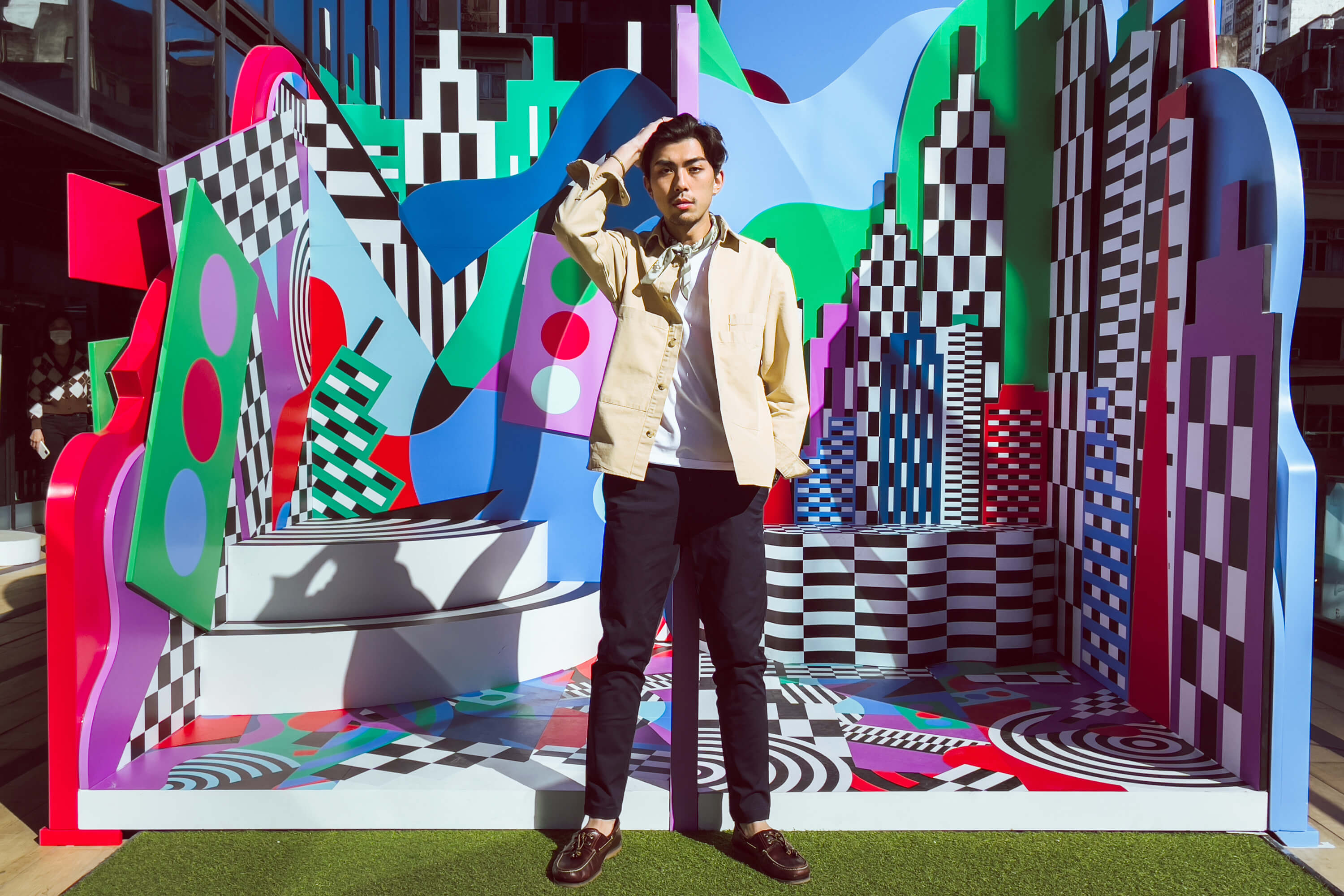
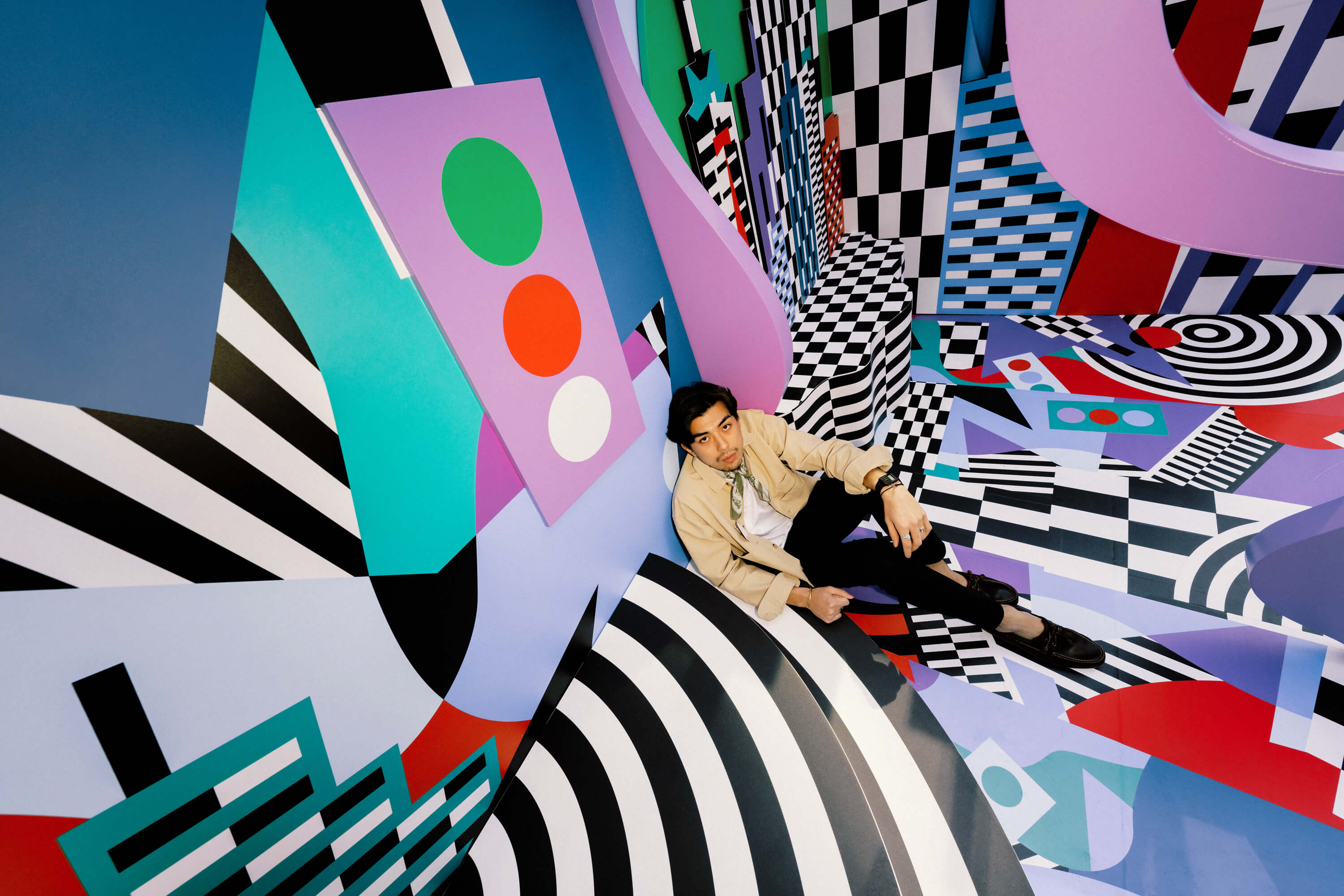
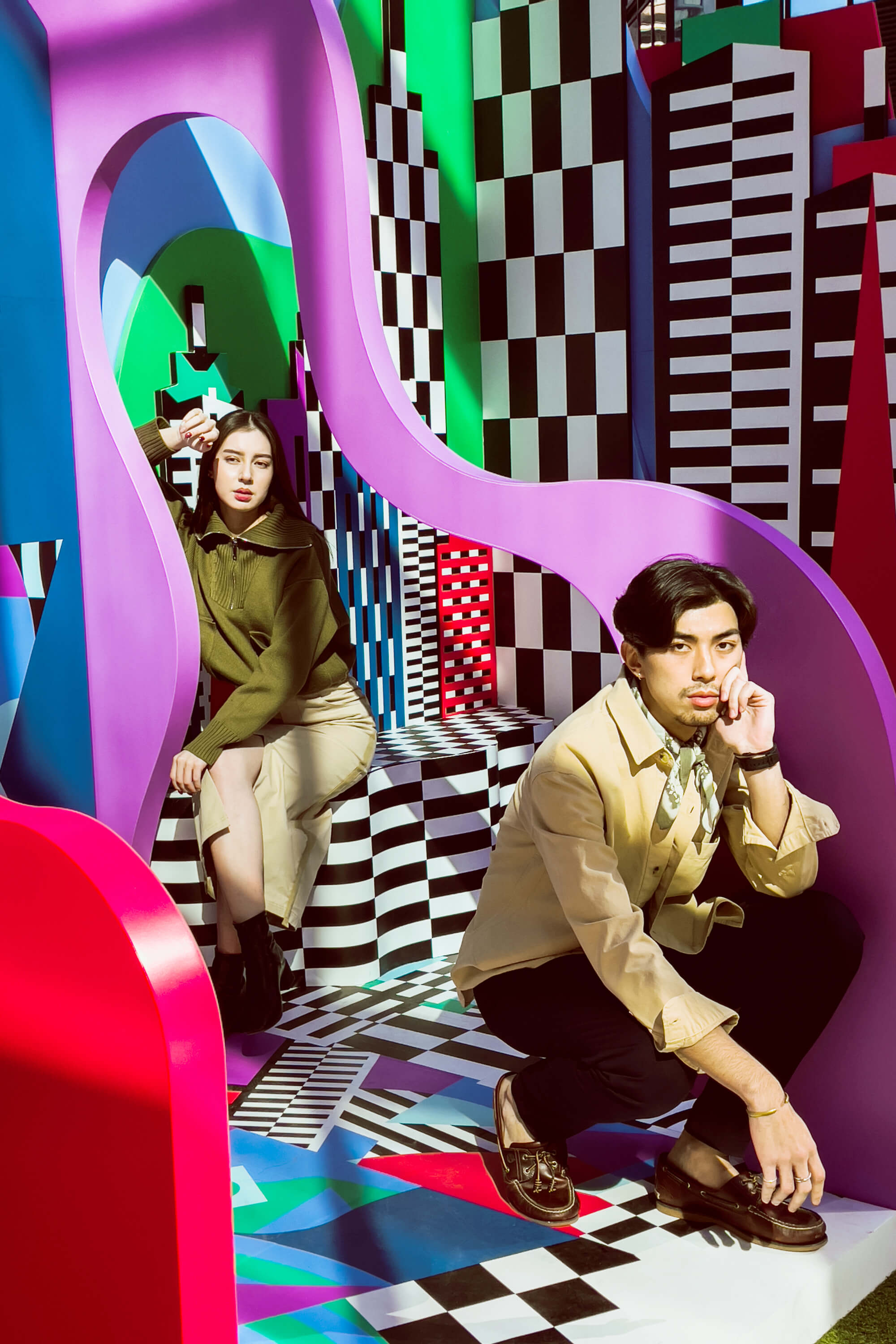
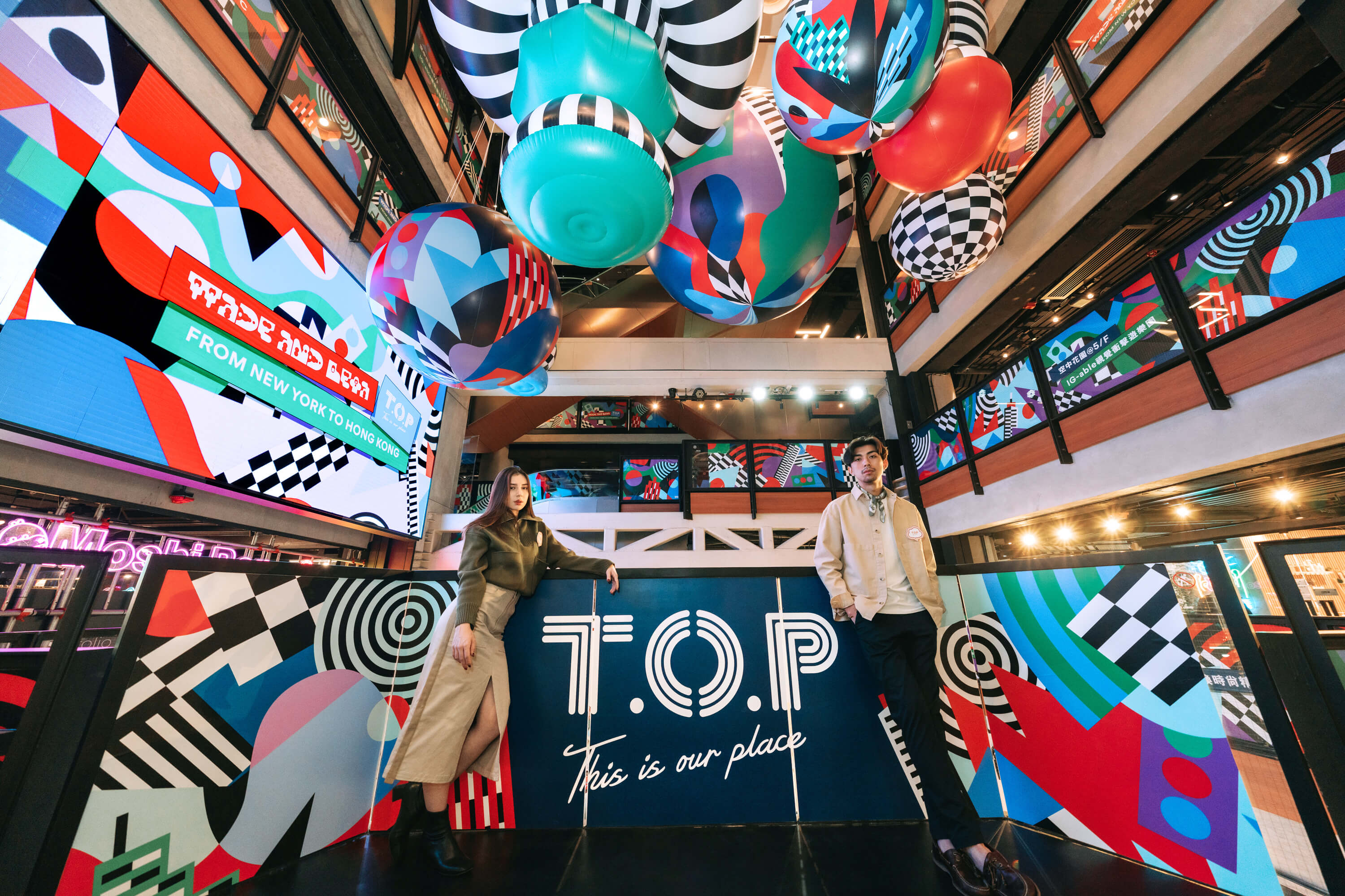
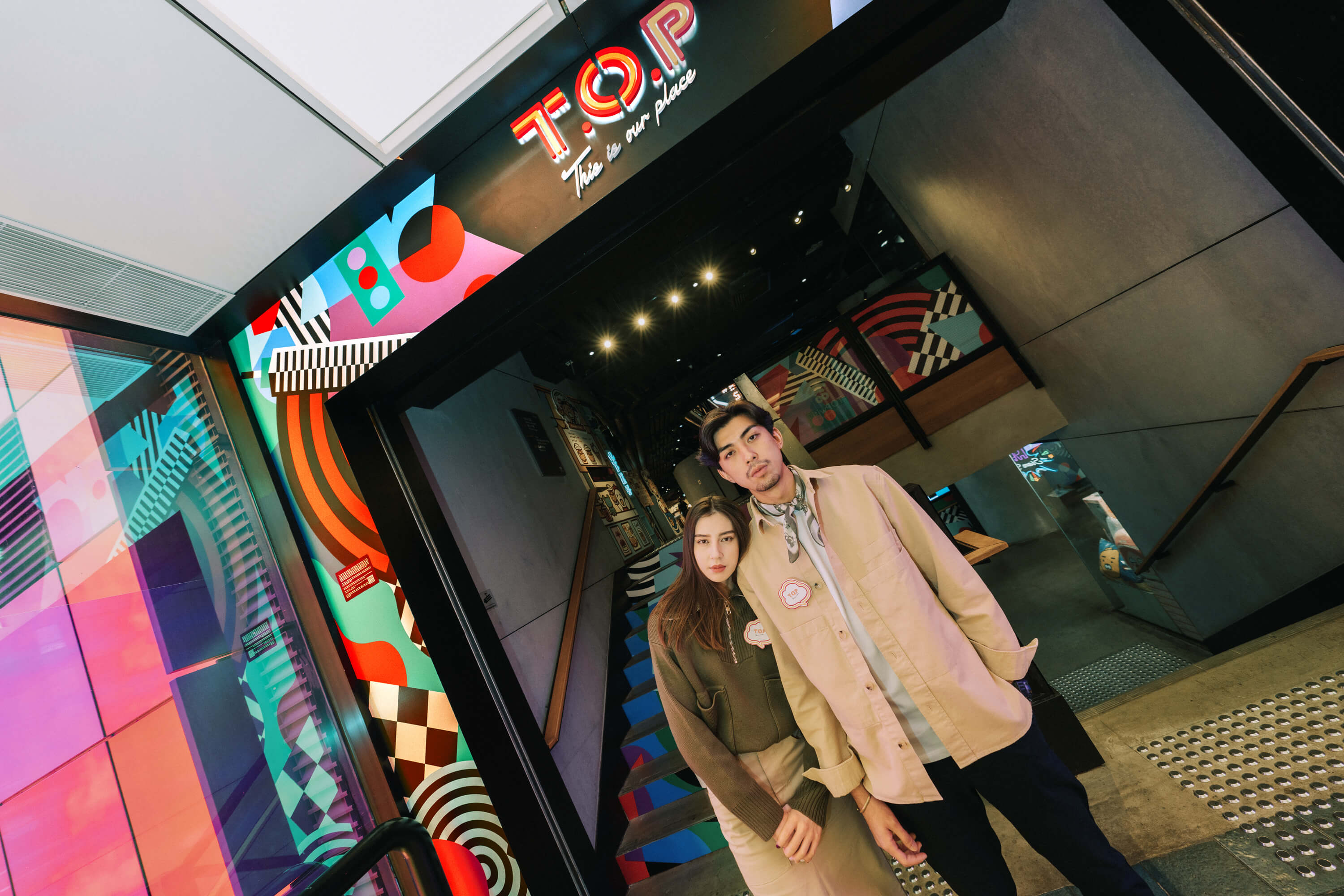
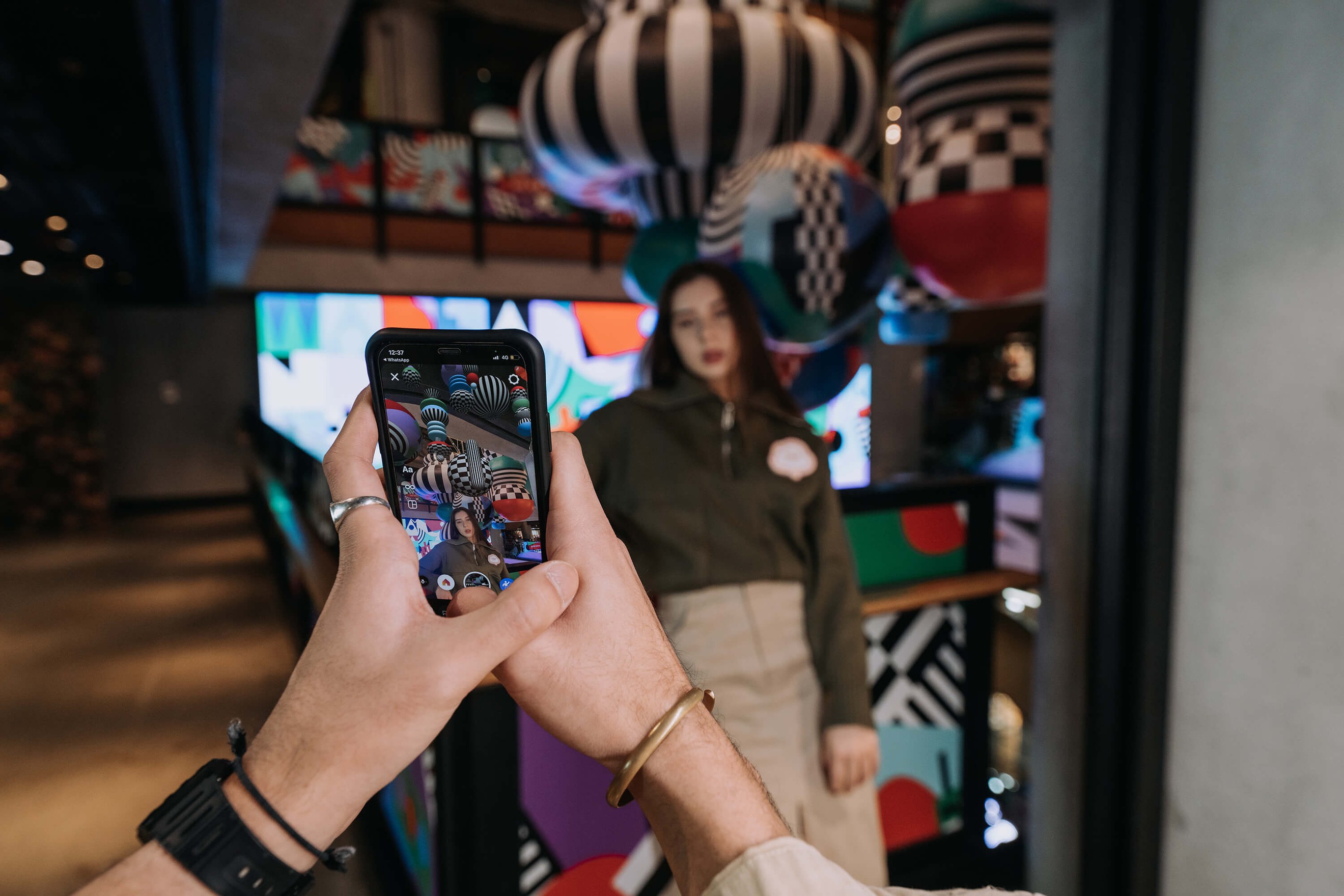
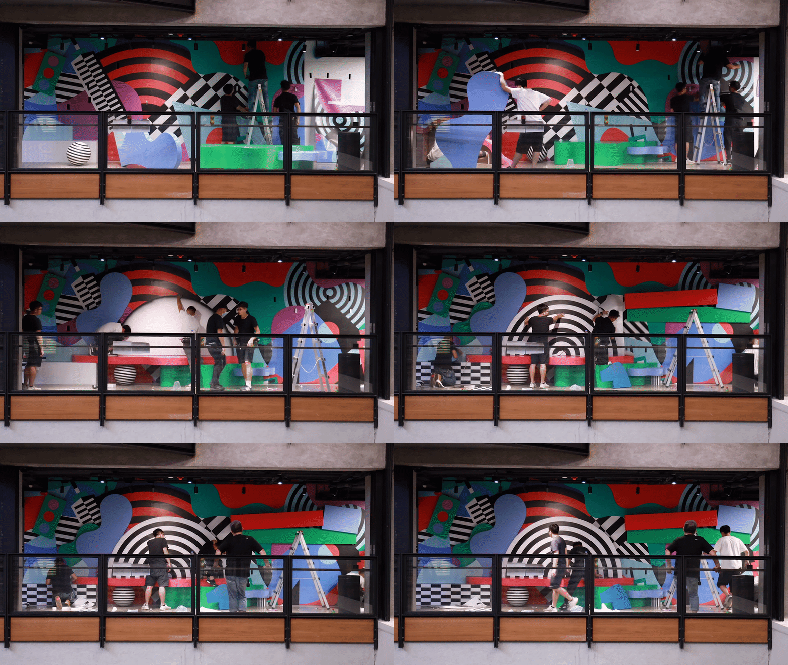
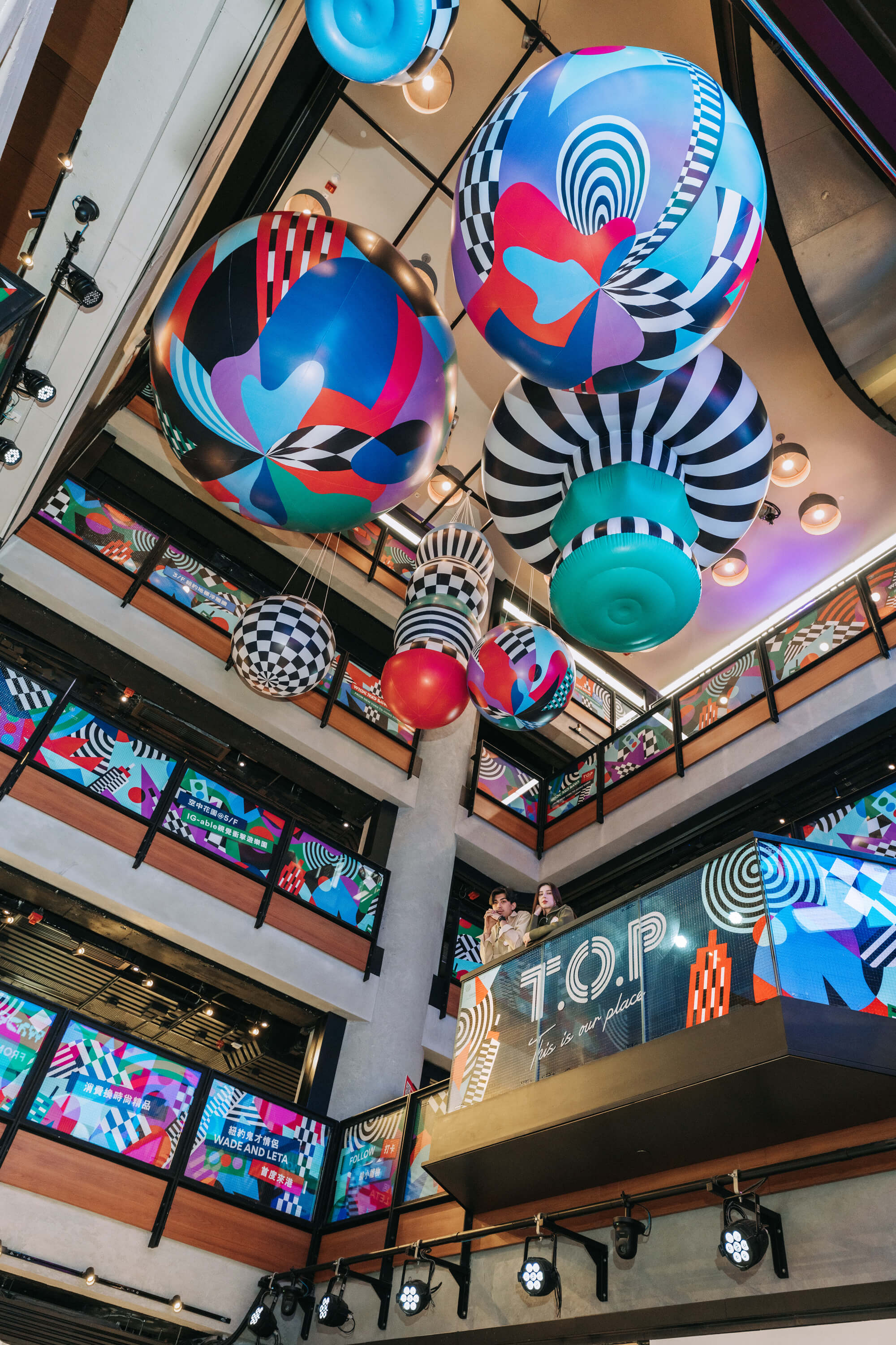
For Christmas 2021, T.O.P This is Our Place, a stylish mall for shoppers and diners in Mong Kok, collaborated with us to bring a little bit of New York City to Hong Kong. For our site-specific installation, we created an array of assets including large-scale inflatables, a photo spot, large leveled benches (for the tired shoppers), and multiple augmented reality activation areas.
We wanted to break the boundaries of space by combining three-dimensional design elements with AR technology to help users lose themselves in a colorful and magical urban architecture forest—creating a 360-degree immersive maze that gets highlighted with AR. The virtual labyrinth and visual amusement park can be photographed from all sides to create complex New York streetscapes and allow people to constantly explore and find new nooks and lose themselves in the abstract display of the explosive colorful world of New York during Christmas.
Healing From Another World for Showfields Miami





Client Showfields Miami
Scope Installation Design, Sculpture, Rug Design, Construction
Year 2021
Credits
Design Wade and Leta
Scope Installation Design, Sculpture, Rug Design, Construction
Year 2021
Credits
Design Wade and Leta
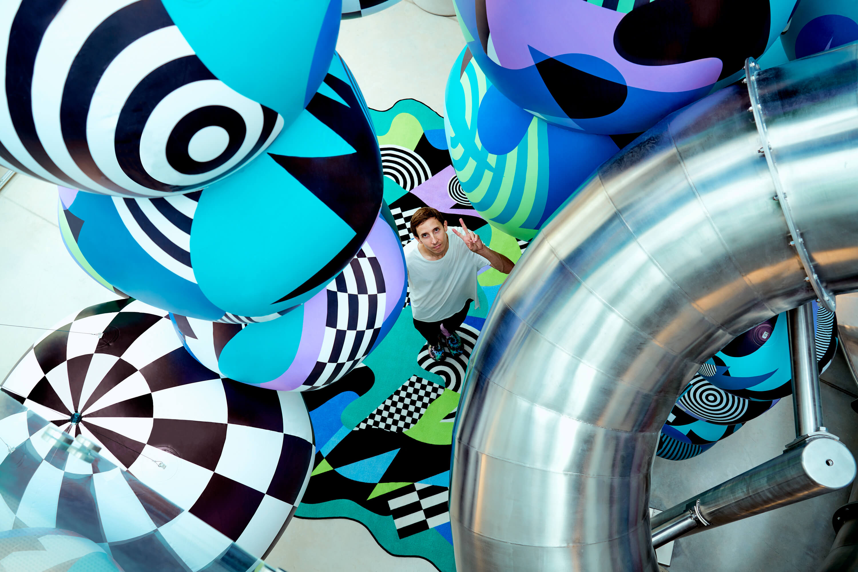
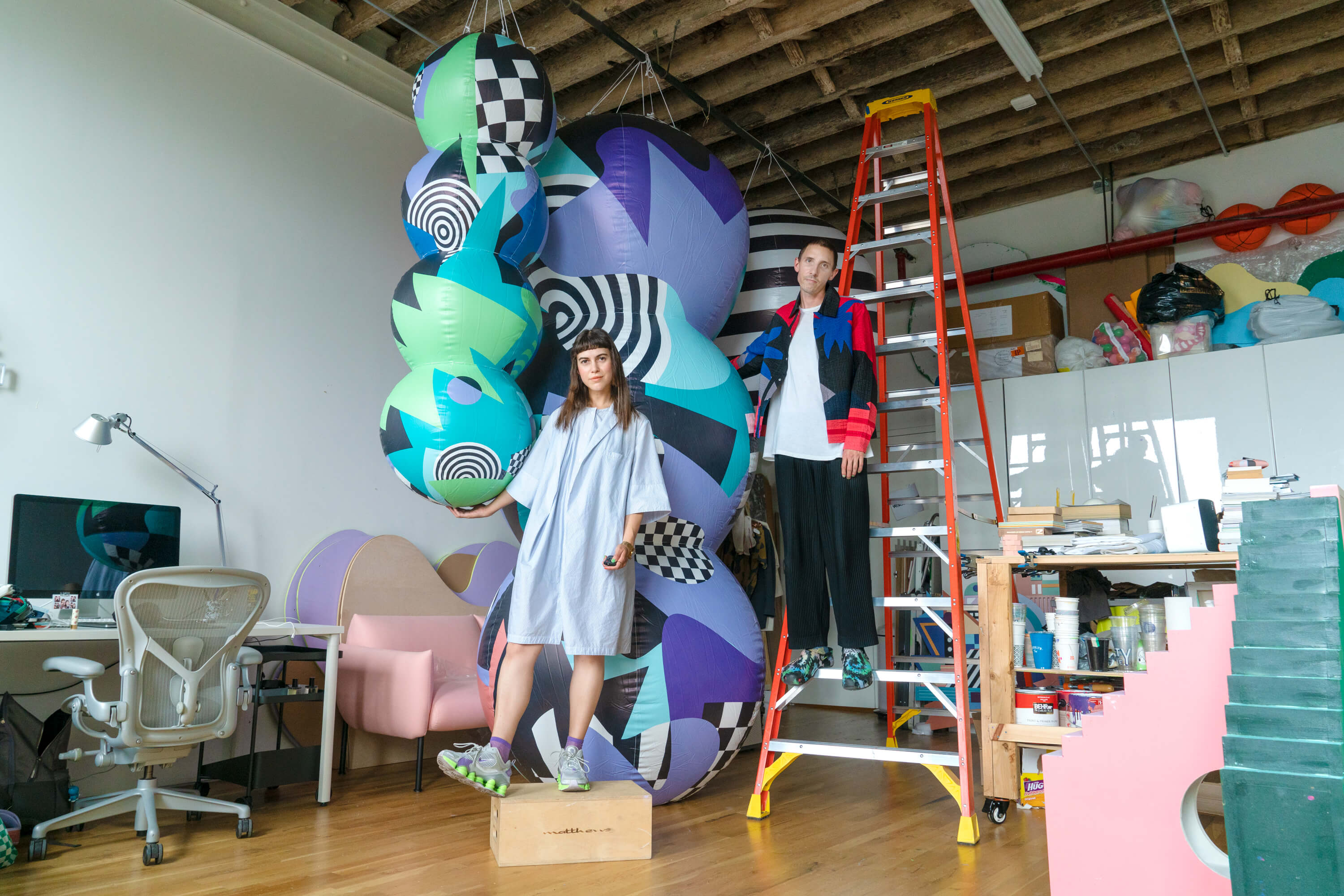
Showfields is a multi-level store highlighting unique, direct-to-consumer brands in wellness, home & design. During the pandemic, they approached us to create an installation that would release once the world had started to "go back to normal".
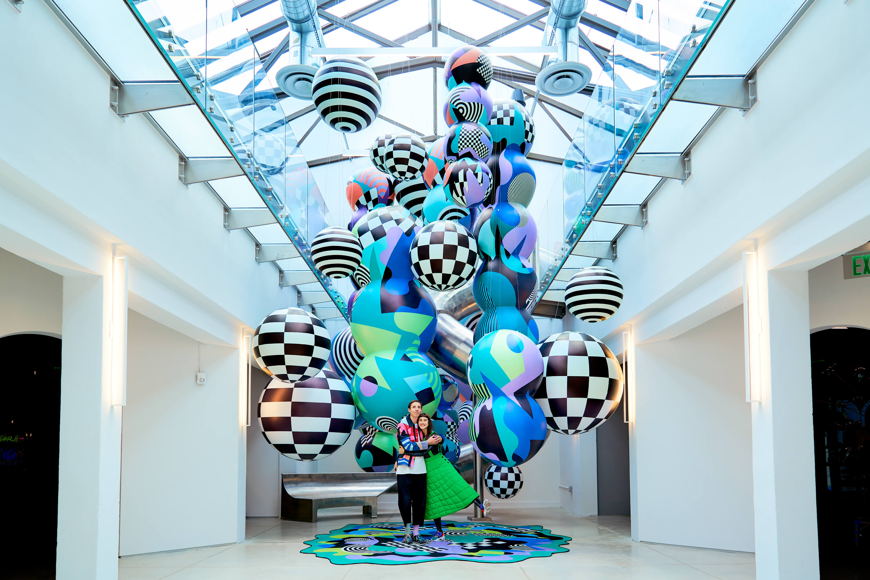
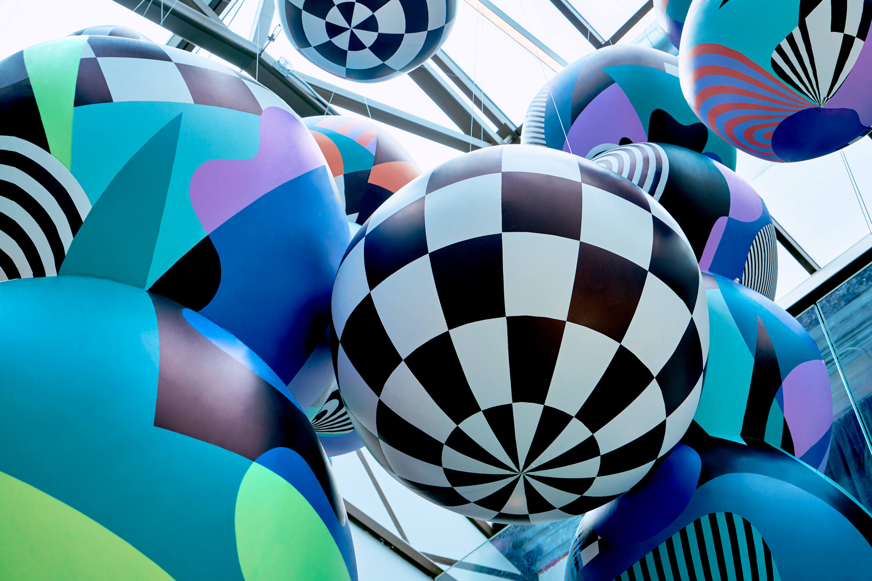
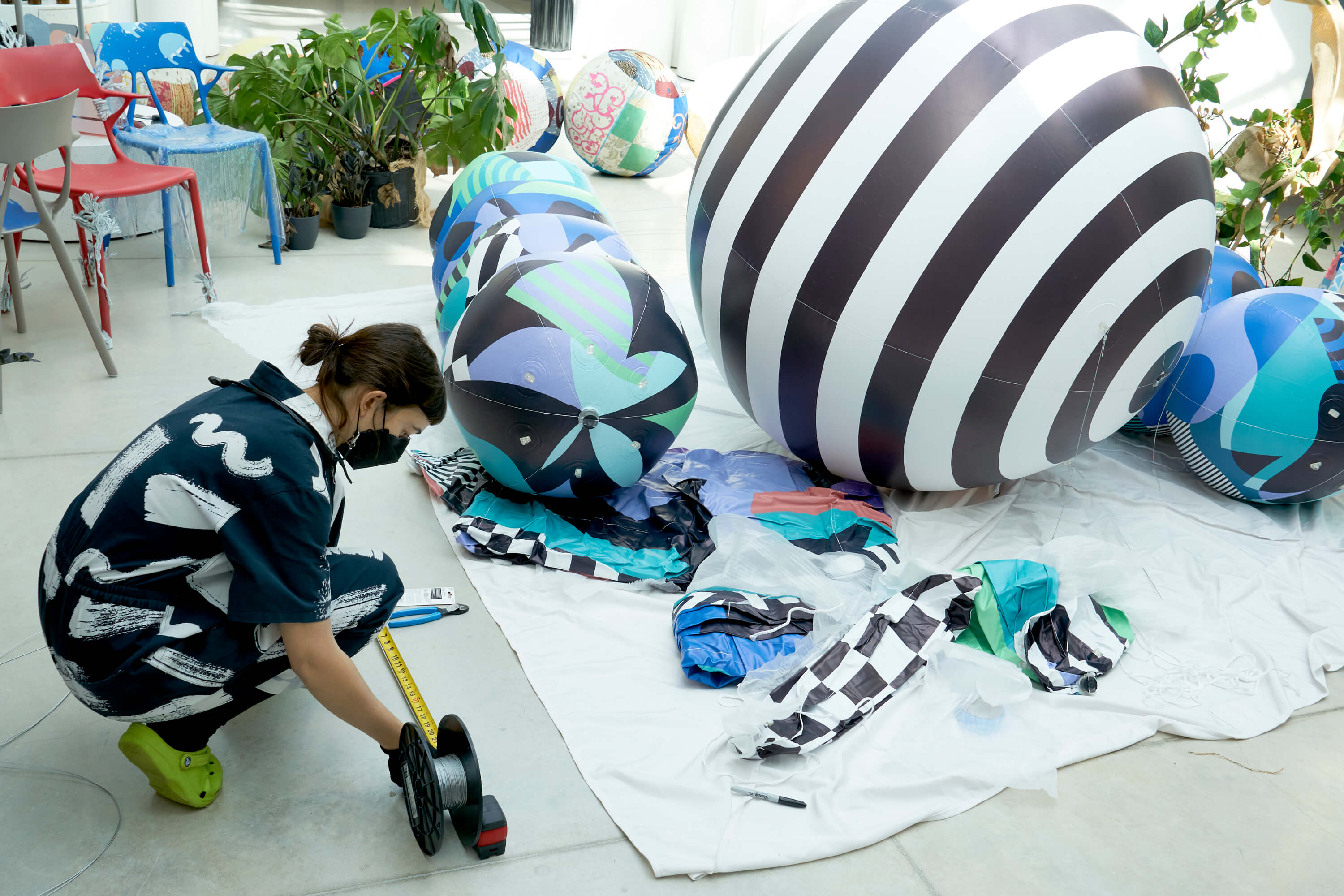
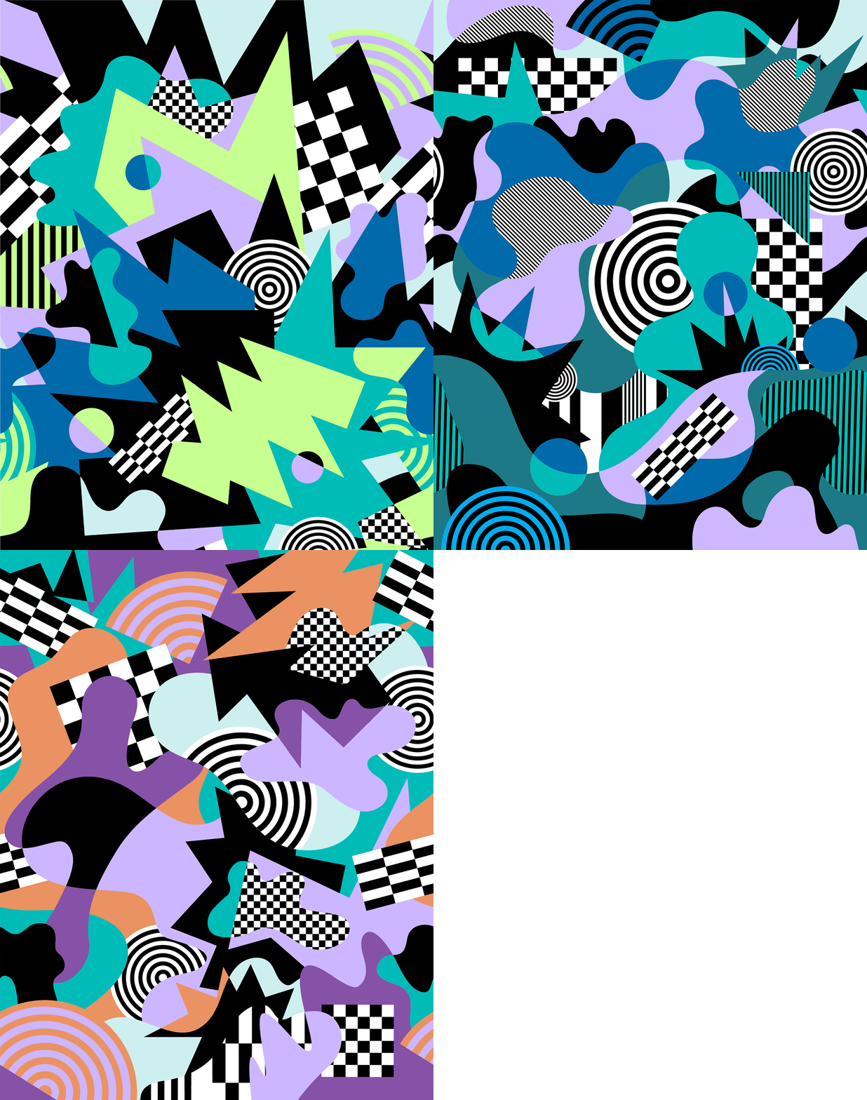
In this site-specific installation, we sought to create a sense of wondrous joy and overwhelming excitement through our piece, “Healing From Another World,” a floating universe that flows and bounces from the first to second floors of Showfields Miami’s historical space, enveloping its metallic slide in a sea of Floridian-inspired hues of color and contrast. The inflatables that compromise this universe reference fluidity and buoyancy, referencing the way in which bubbles disperse within the water as ocean waves tickle the shore.
Healing From Another World is a captivating visual experience that seeks to encourage all of those who observe it to search high, low, near, far, in, out, and around for new ways of seeing. Whether standing on the second floor to gaze down at its tops, or to lay on the floor and stare upwards at the roof, this installation incites the idea that art is approachable to all who wish to interact with it, and visitors are encouraged to formulate their own perspectives. In the way that all humans perceive color differently, all humans find meaning in what they see and every meaning is subjectively correct.
Adobe x Wade and Leta




Client Adobe
Year 2021
Scope Design, Furniture Design, Sculpture, Painting, Construction
CNC Cutting Division NYC
Video Director Colin McAuliffe (Zero One)
Video Production Adobe
Year 2021
Scope Design, Furniture Design, Sculpture, Painting, Construction
CNC Cutting Division NYC
Video Director Colin McAuliffe (Zero One)
Video Production Adobe
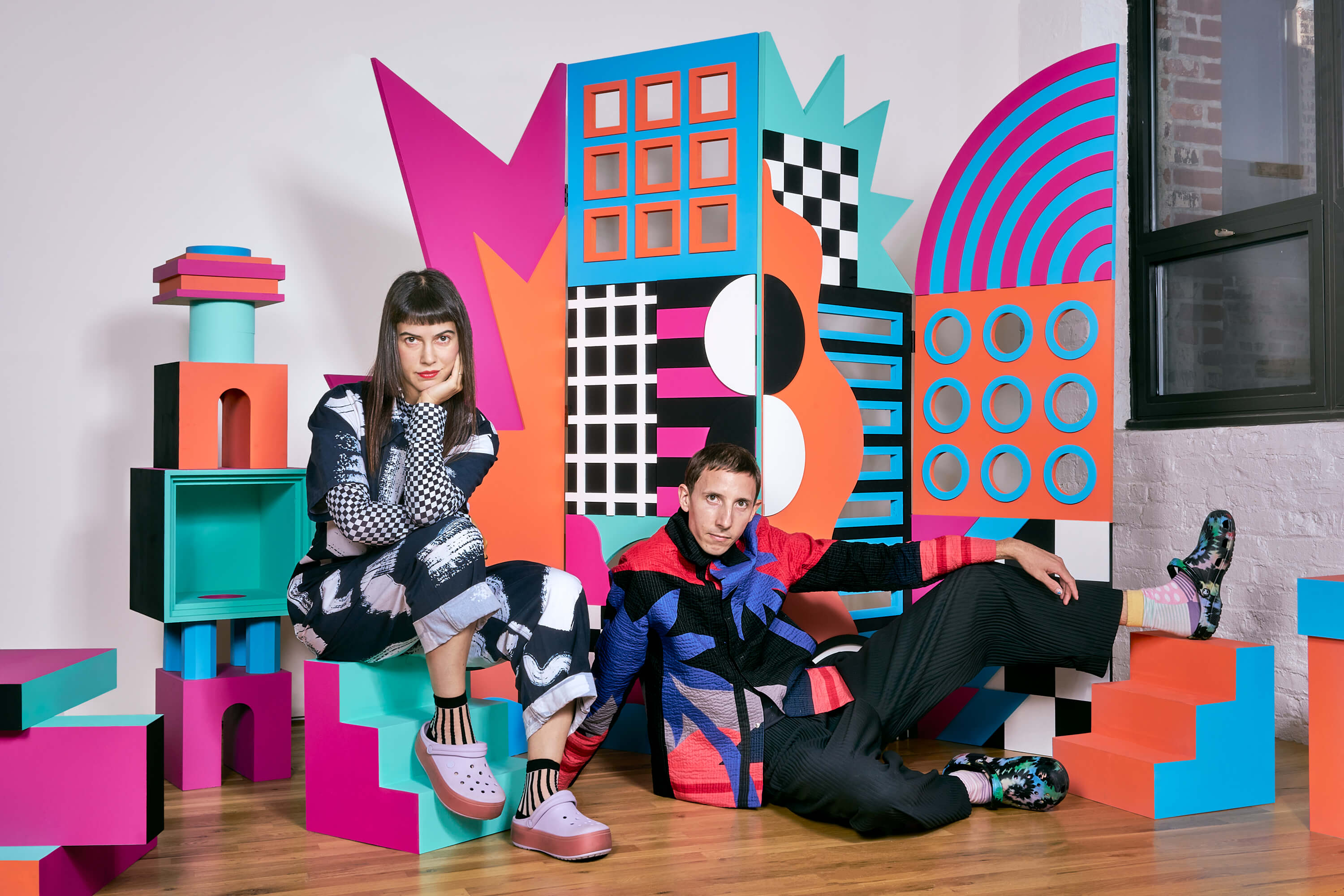
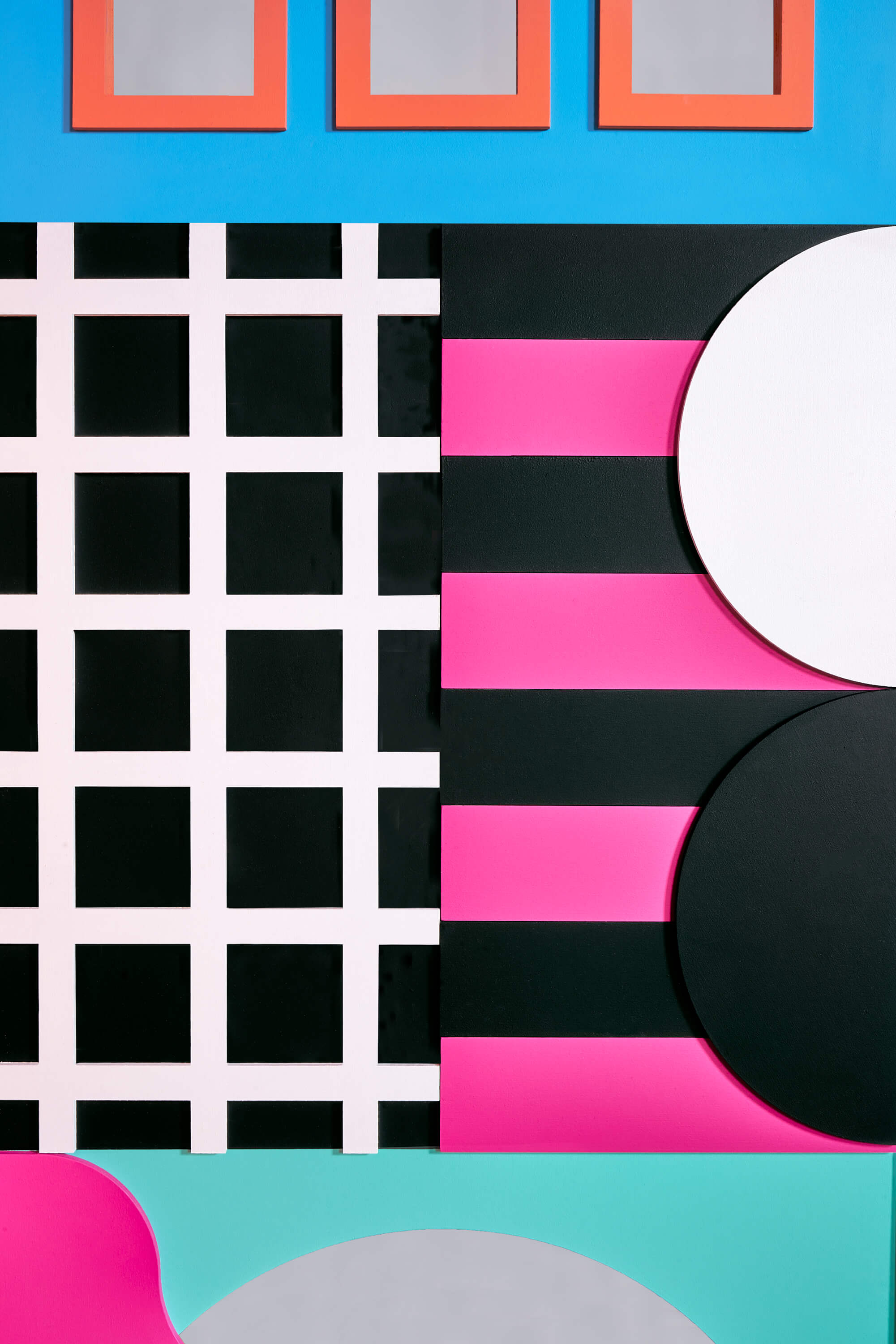
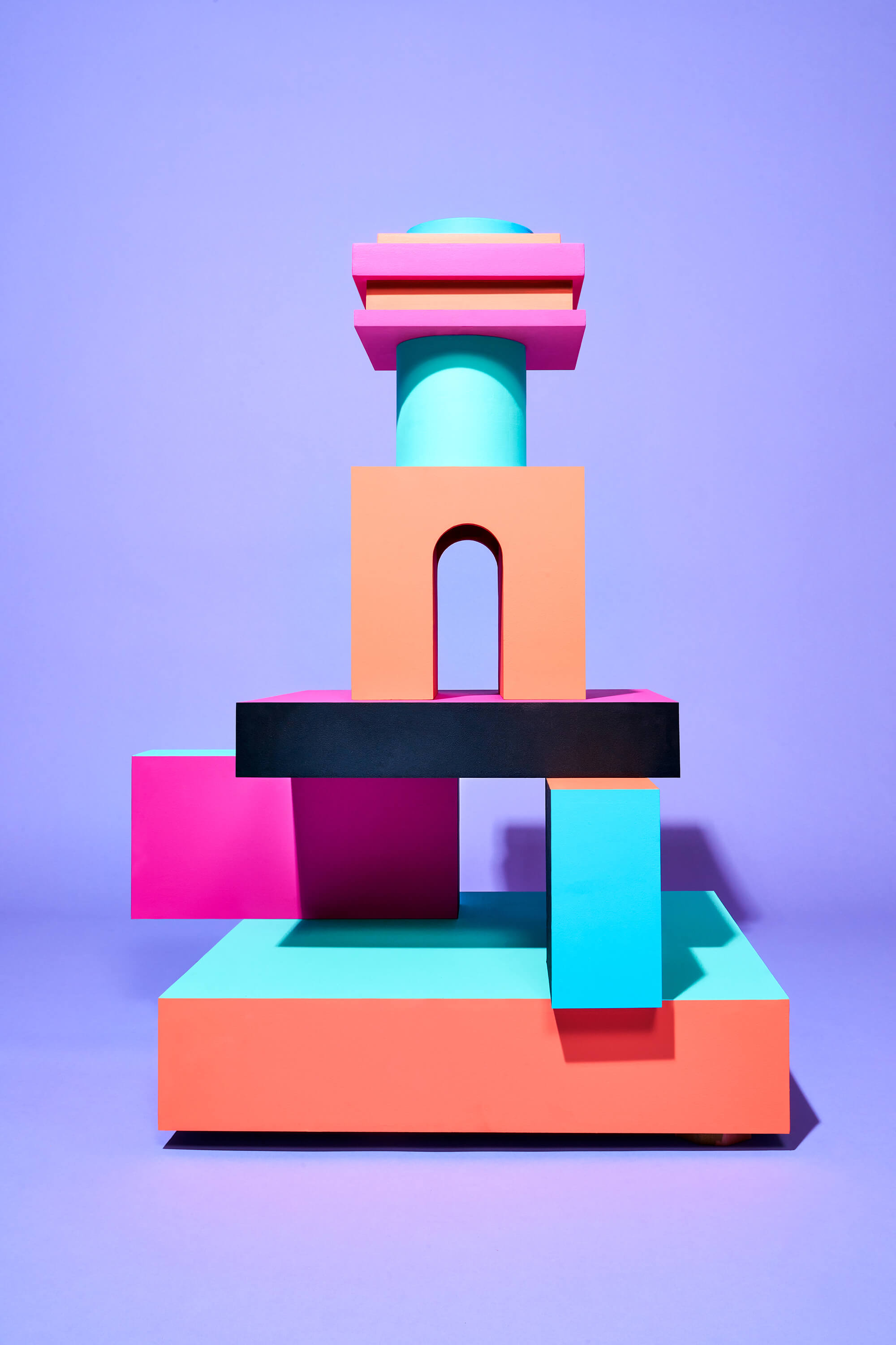
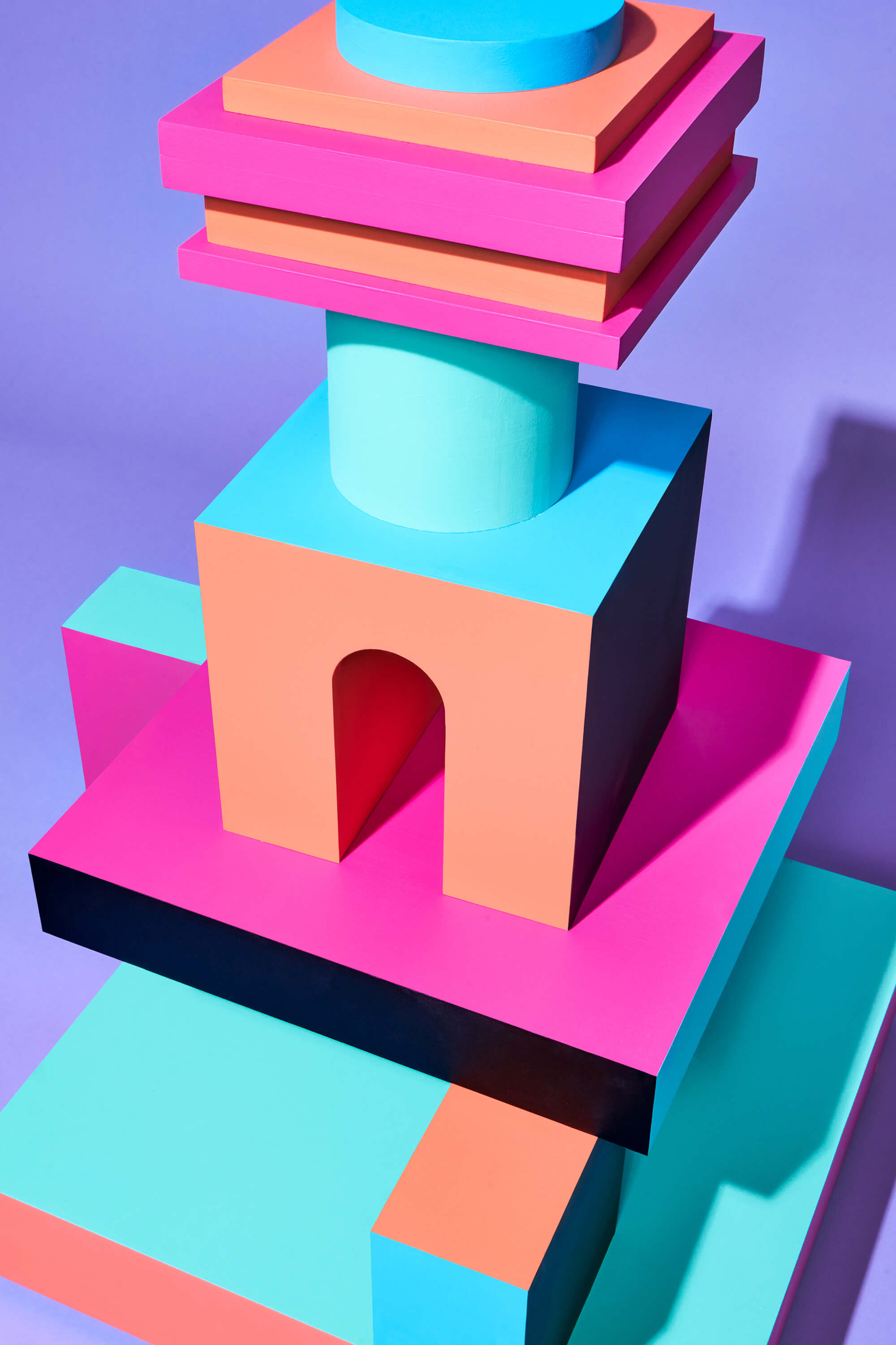
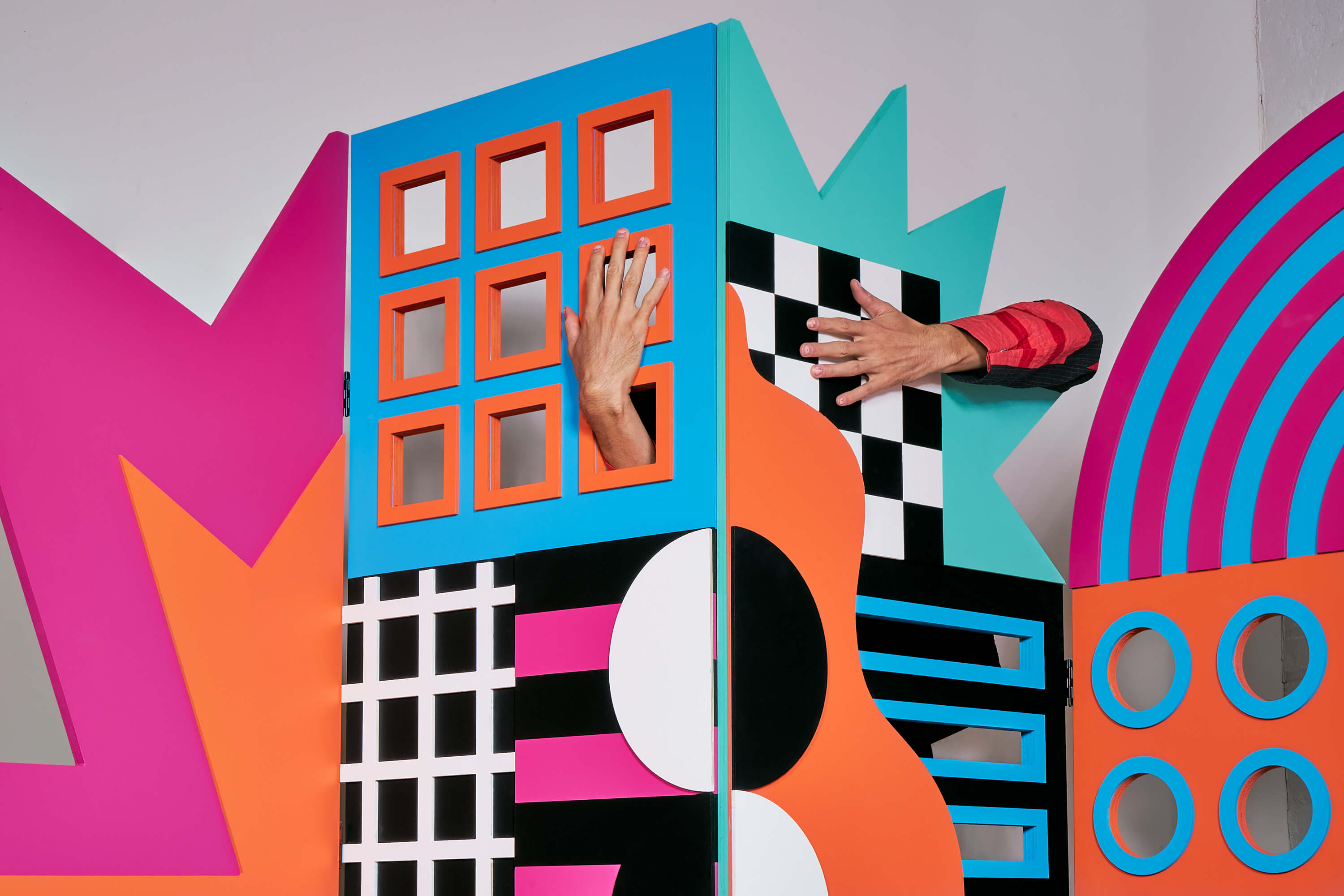
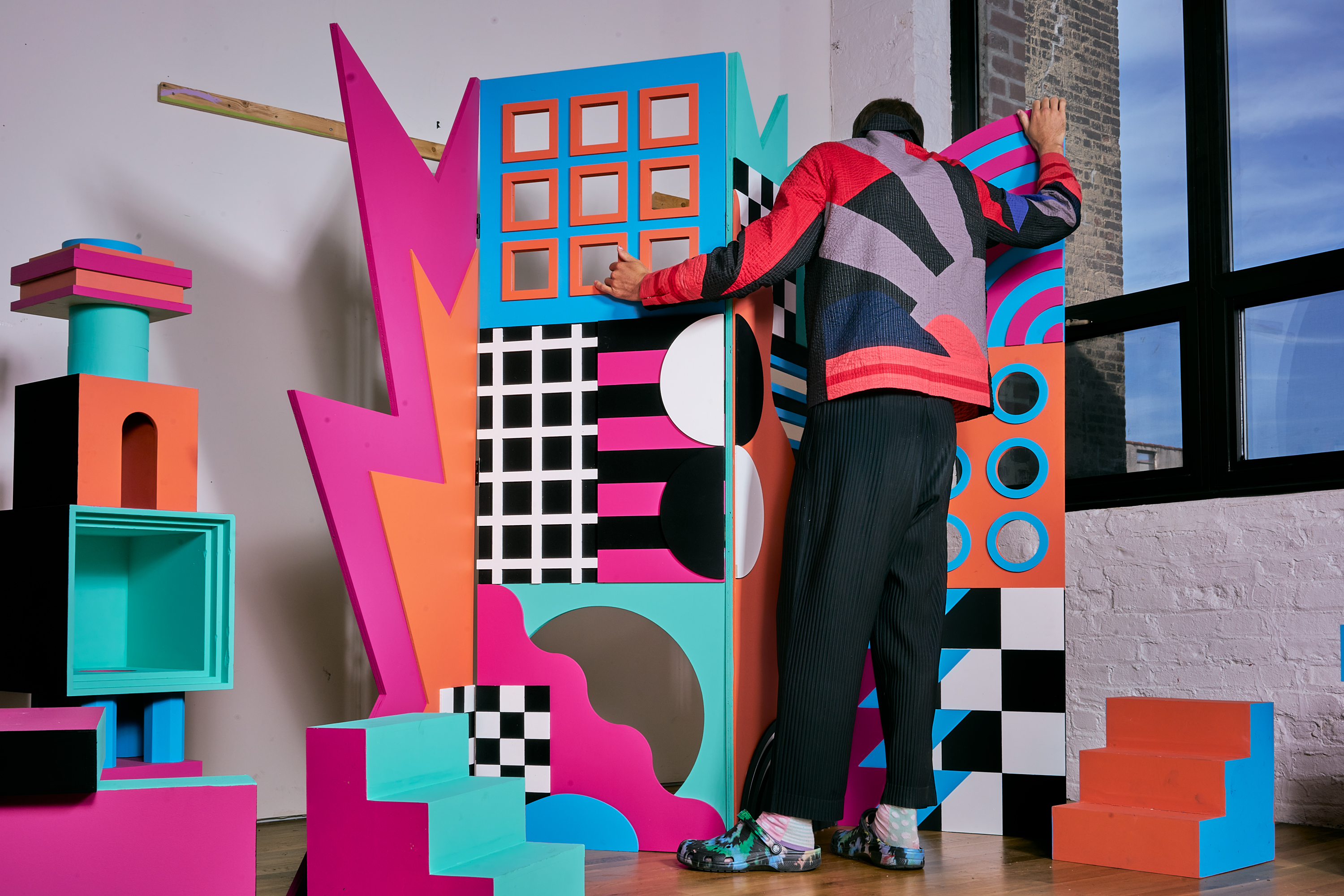
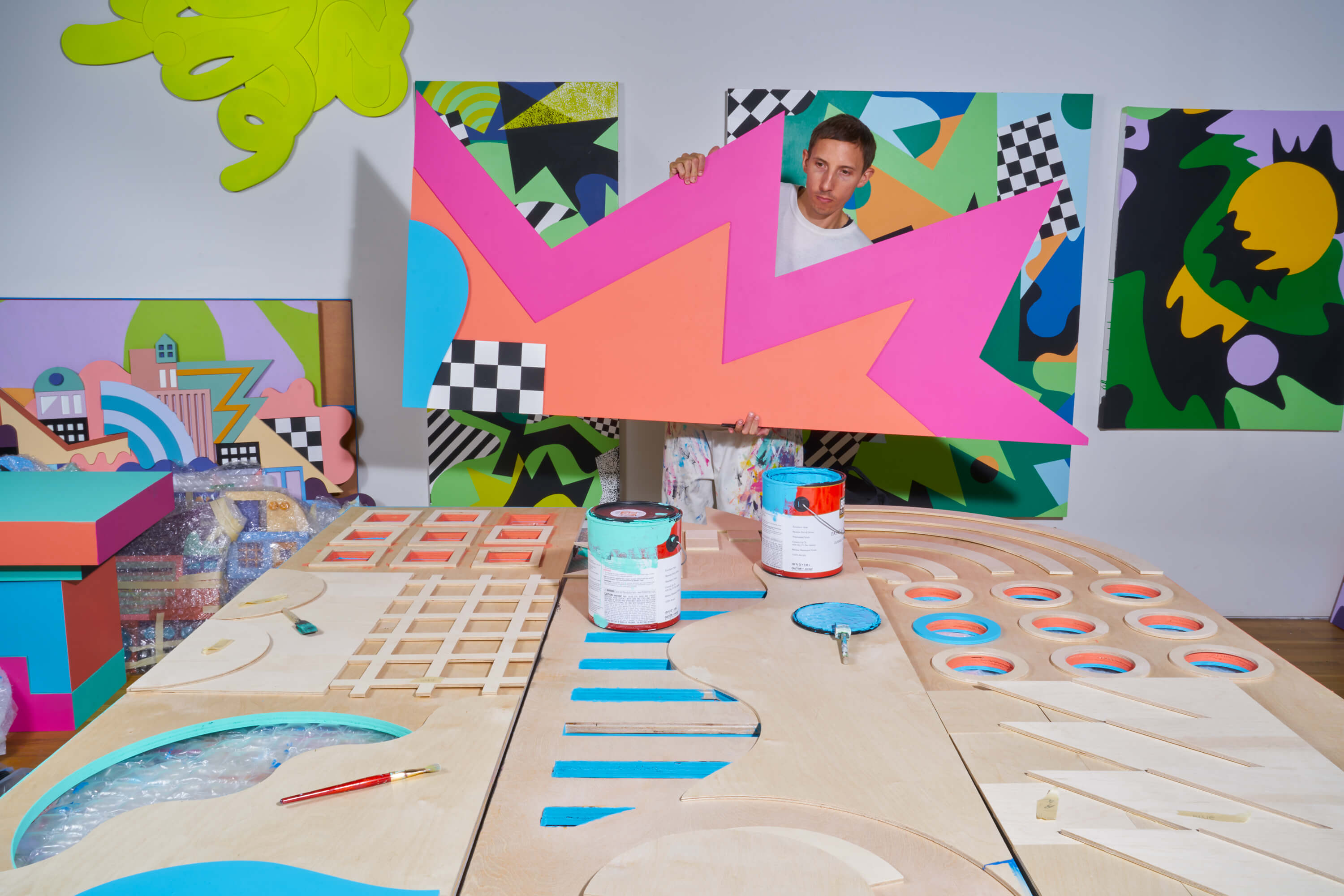
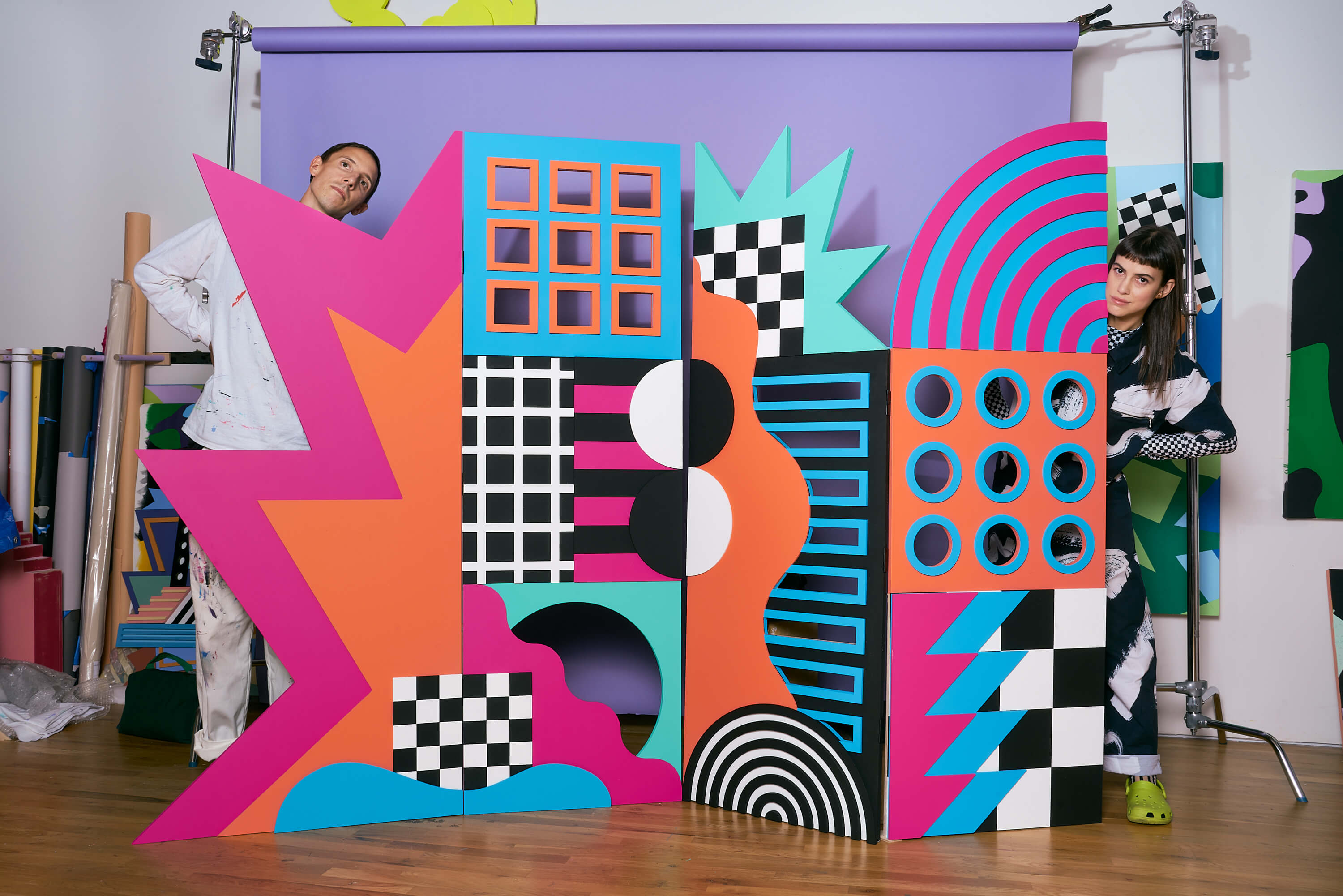
A few months ago, Adobe contacted us with a brief. In order to highlight influential moments in design history, they came to us asking if we could speak about our love for the Memphis Milano movement and to share how it has influenced our way of working within the vernacular of our studio. Of course, we couldn’t say no! Memphis Milano is an Italian design and architecture group founded by the “godfather of Memphis,” Ettore Sottsass, and was active from about 1980 to 1987. The group designed furniture, lighting, fabrics, carpets, ceramics, glass, and metal objects as a way to rebel against the black and white sleek modernist trends of the time.
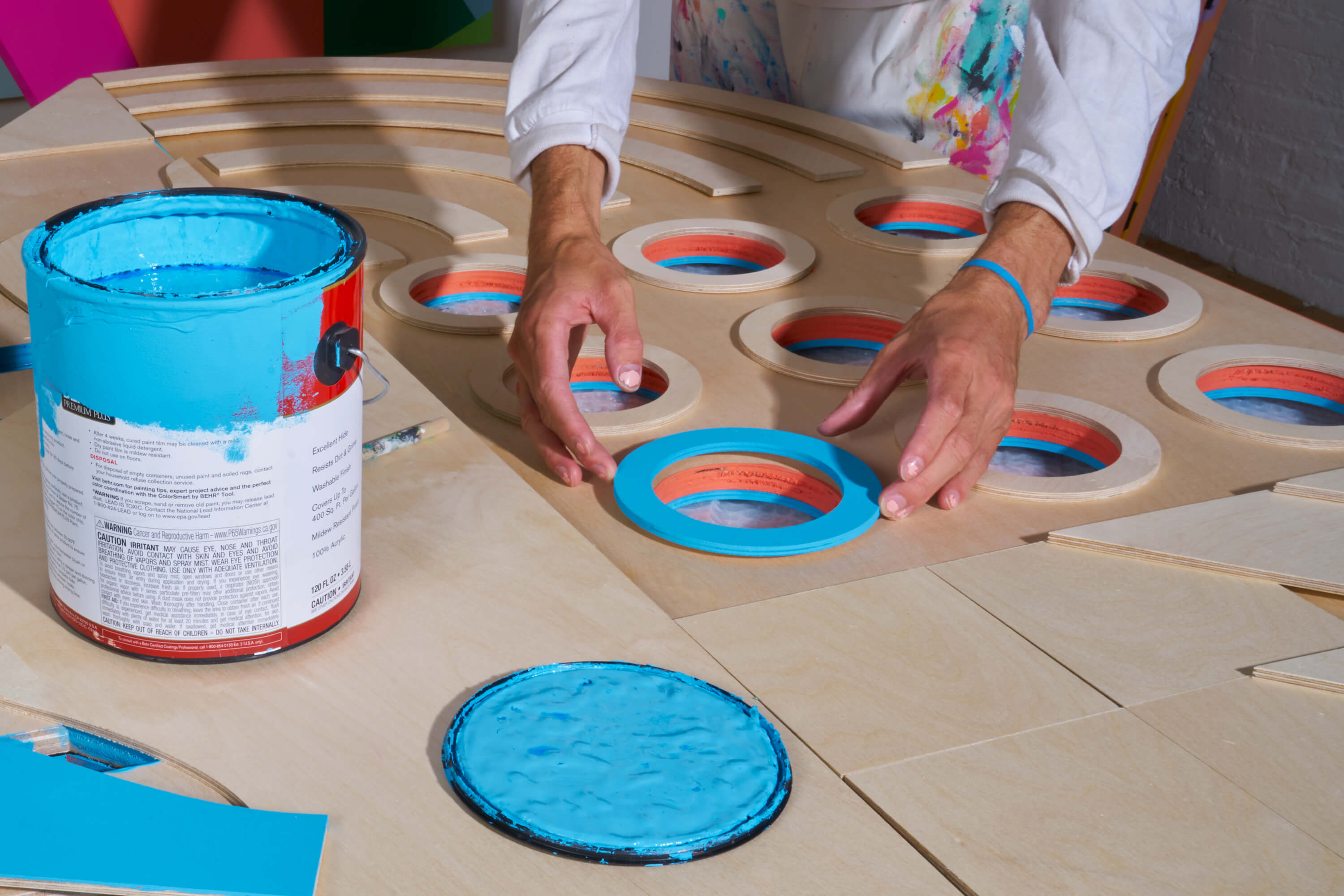
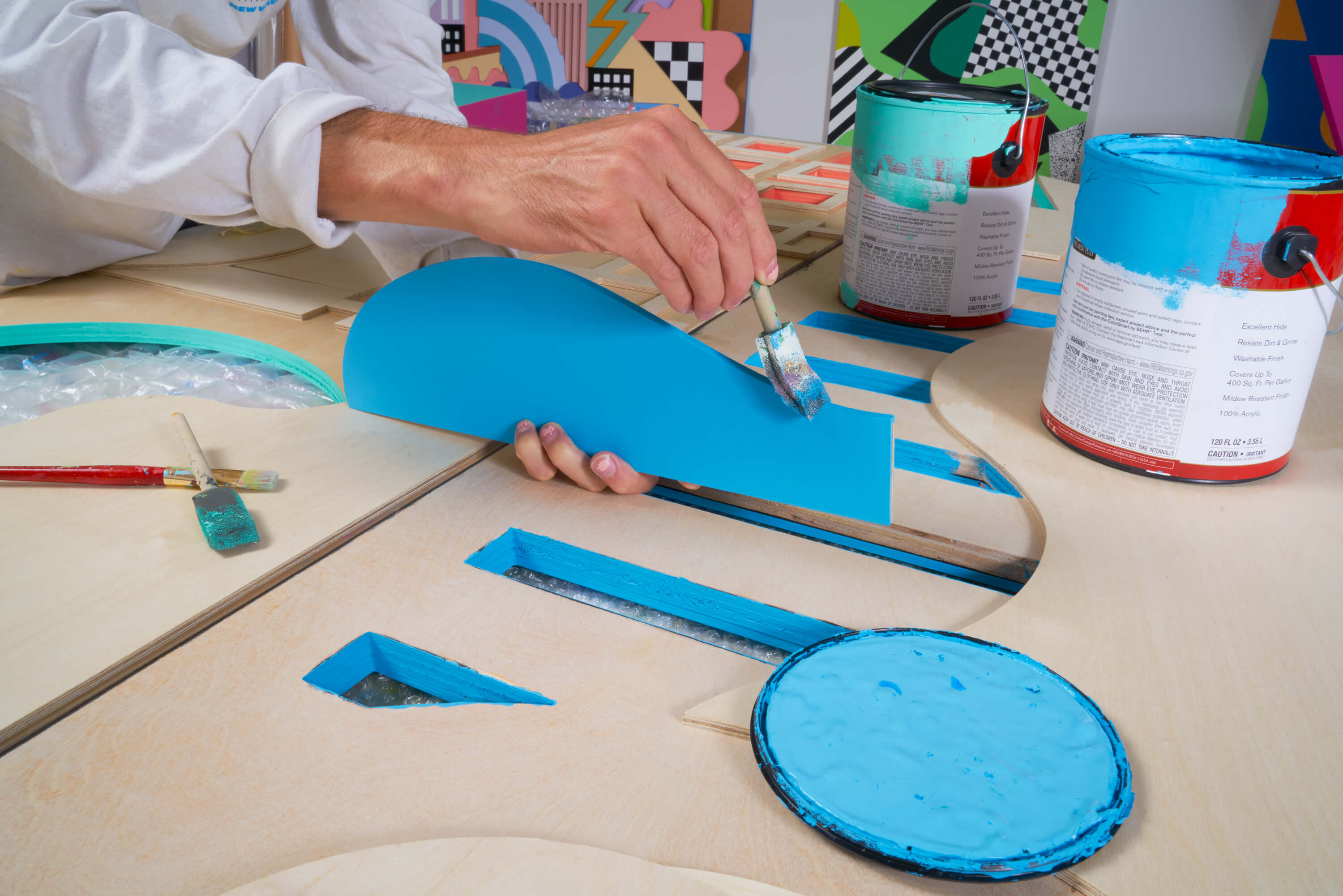
Initially beginning as a video project about the history of Memphis to inspire those who were discovering this movement in design history for the first time, this opportunity would also feature our studio and how we were personally inspired by Sottsass and his friends and so we wanted to use the vibrant energy of the movement as inspiration for us to create a piece that would be included within the video. We fashioned a room divider and several stools to supplement the space, all painted in vibrant melon, fuchsia, mint, and cerulean blue. We worked closely with the team at Adobe Create to make a video that could help inspire those who were discovering this influential moment in design history for the first time and to share how fun and enjoyable design history can truly be. In addition, we created a set of free design assets that would help encourage designers to break out of their comfort zones and work with a reestablished toolkit to design a piece of their own.
Whether you’re new to design or have been in the know for many years, we hope you’ll learn something new (or at least get a little laugh) from our collaboration! It was a true pleasure and honor to contribute to this piece that aims to educate those new to this movement, as well as those simply looking to brush up on their history.
Yellowpop x Leta


LEGO x Leta - Adidas Originals Artist Collaboration
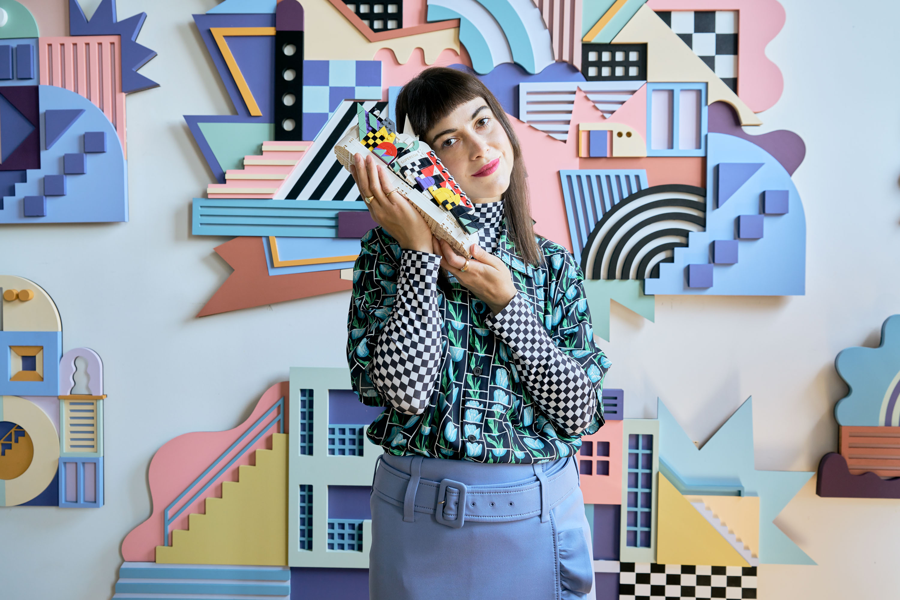
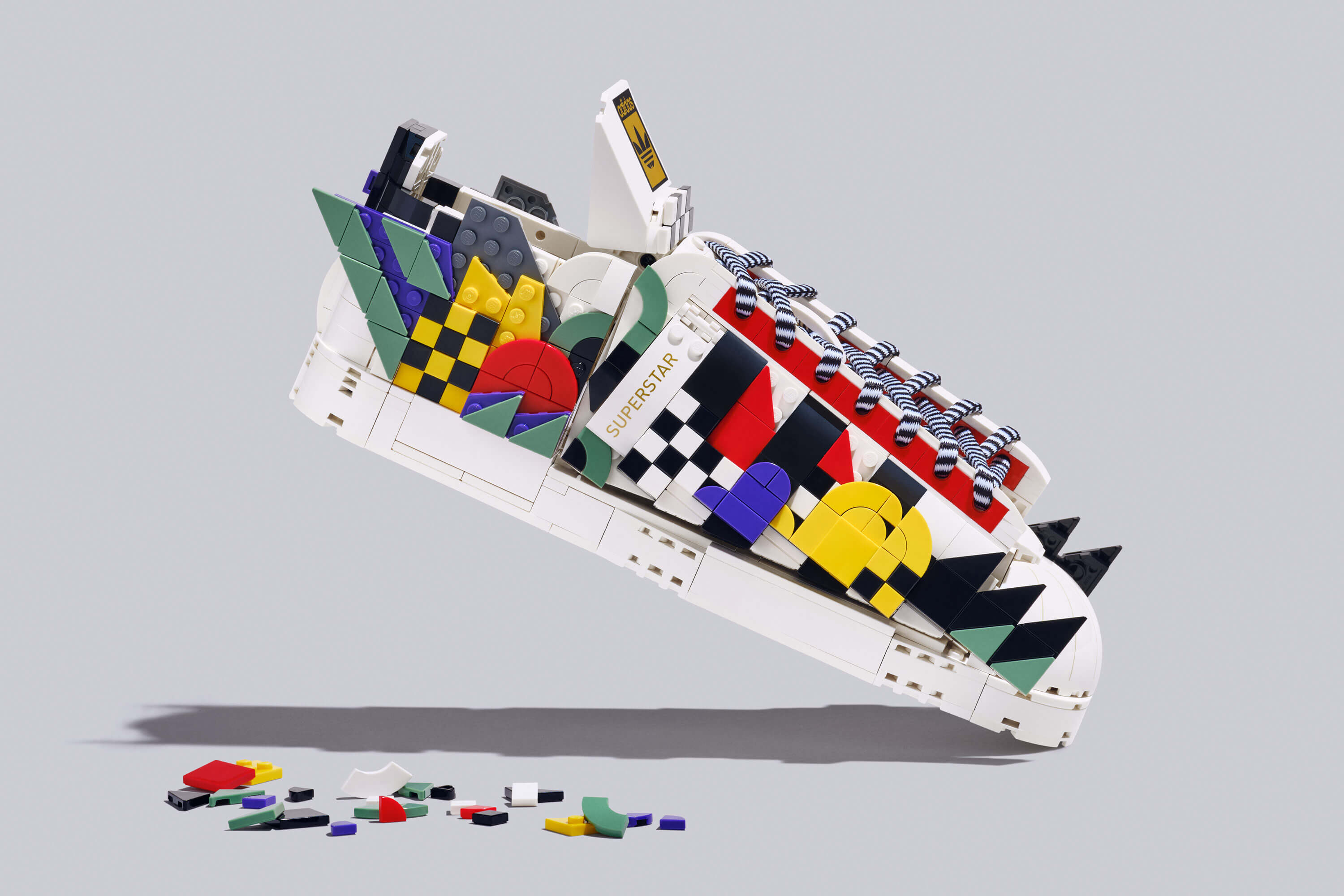
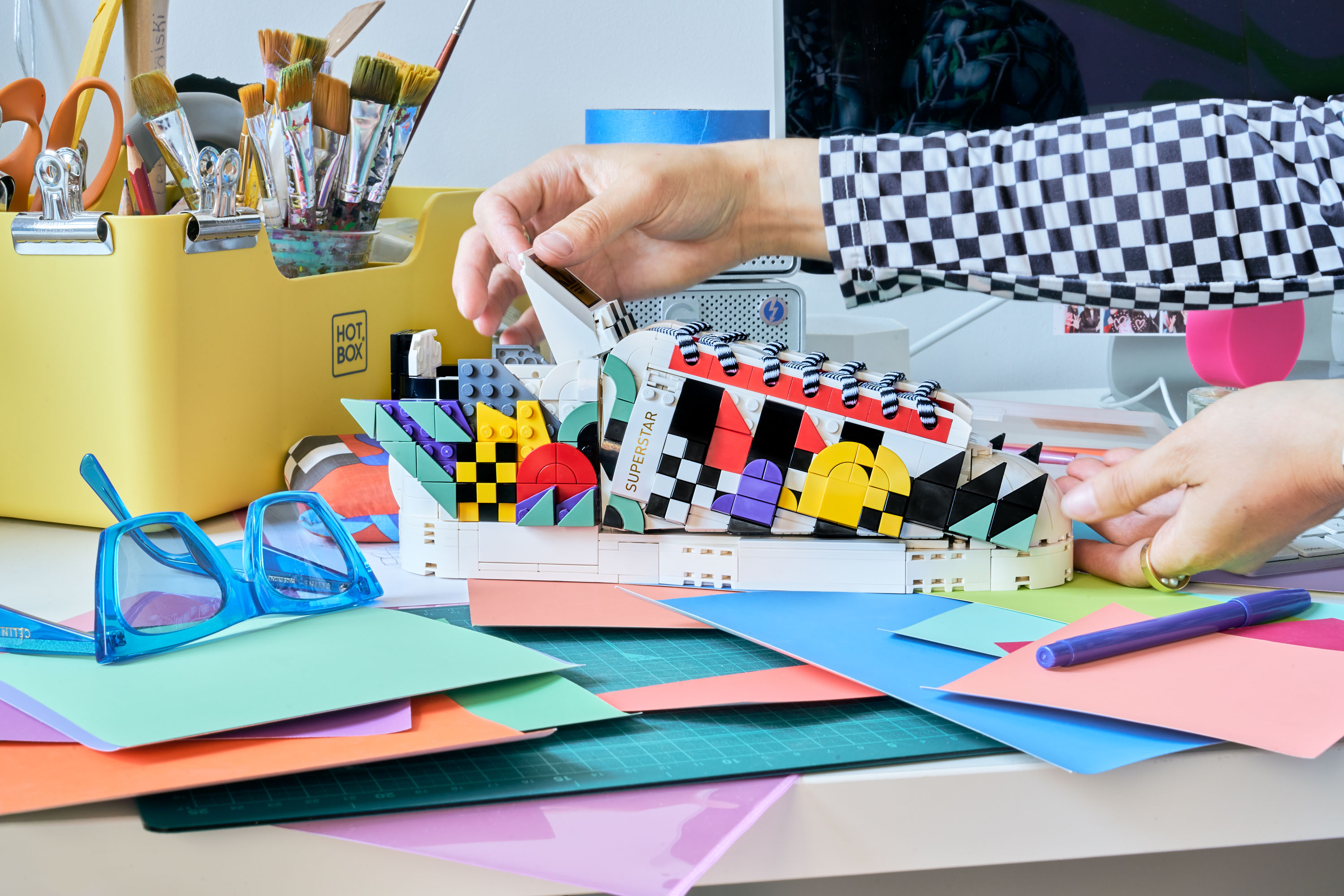
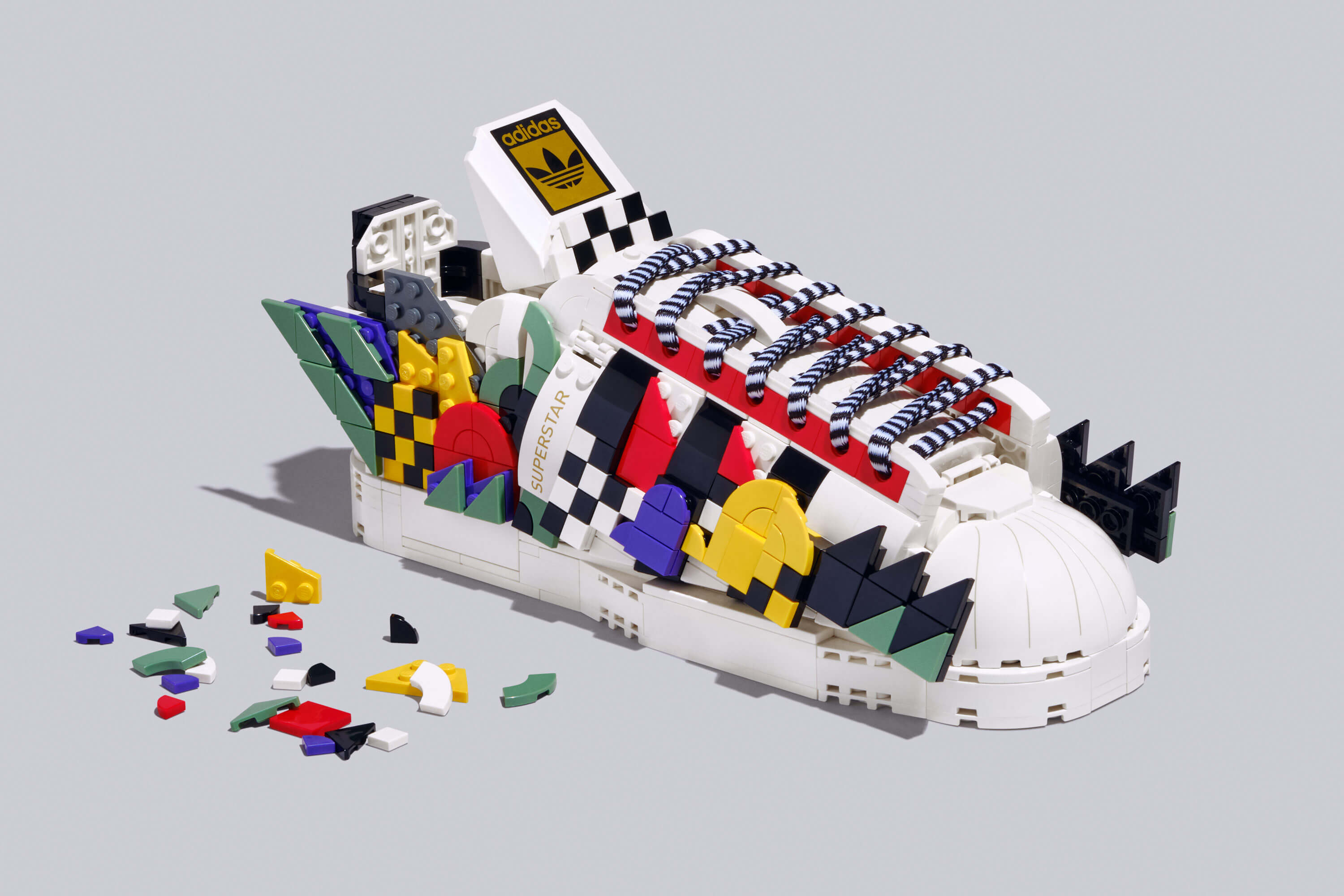
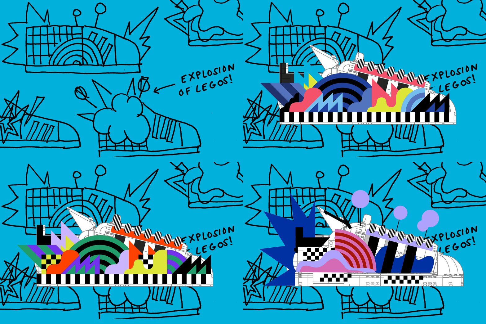
The sneaker and toy industries are worlds apart, but when their paths occasionally cross, pretty cool things can happen.
As a tool many of us have used since childhood, LEGO is a timeless material that does not cater to one age or one demographic. It is boundless and full of possibility, and for the launch of the LEGO x Adidas Originals Superstar set, Leta was approached to create a remix for the classic silhouette. This highly covetable sneaker was originally released as a basketball shoe back in 1969. Since then, the Superstar has transcended sports and become one of the most versatile streetwear staples around the world.
As a tool many of us have used since childhood, LEGO is a timeless material that does not cater to one age or one demographic. It is boundless and full of possibility, and for the launch of the LEGO x Adidas Originals Superstar set, Leta was approached to create a remix for the classic silhouette. This highly covetable sneaker was originally released as a basketball shoe back in 1969. Since then, the Superstar has transcended sports and become one of the most versatile streetwear staples around the world.
