New York Times Op-Ed


Client The New York Times
Category Editorial
Year 2016-Ongoing
Art Direction Wade Jeffree and Leta Sobierajski
Photography Wade Jeffree and Leta Sobierajski
NYT Art Director Alexandra Zsigmond
Category Editorial
Year 2016-Ongoing
Art Direction Wade Jeffree and Leta Sobierajski
Photography Wade Jeffree and Leta Sobierajski
NYT Art Director Alexandra Zsigmond
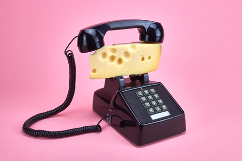
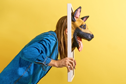
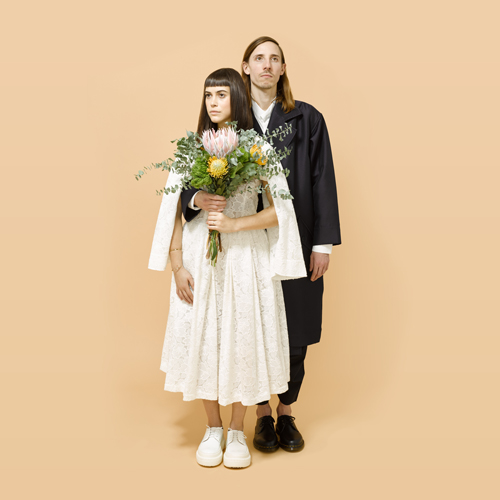
Various Photo Illustration for the Sunday Op-Ed edition of the New York Times. From top to bottom:
“The Anti-KKK Movement”
“What Gucci Can Teach the Democrats”
“Drinking By the Numbers”
Services Art Direction, Photography, Costume
“The Anti-KKK Movement”
“What Gucci Can Teach the Democrats”
“Drinking By the Numbers”
Services Art Direction, Photography, Costume
Likeminds Conference 2016
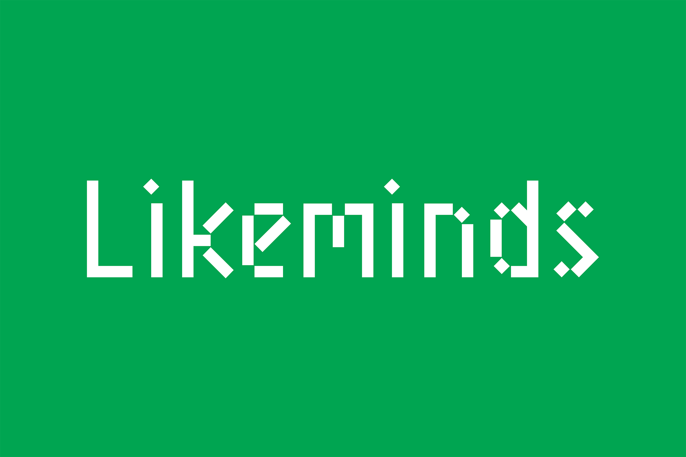


Client Likeminds Conference
Category Brand Identity
Year 2016
Graphic Design and Art Direction Wade Jeffree and Leta Sobierajski
Photography Meredith Jenks
Modeling Wade Jeffree, Leta Sobierajski, Meredith Jenks
Web Development HumanNYC
Category Brand Identity
Year 2016
Graphic Design and Art Direction Wade Jeffree and Leta Sobierajski
Photography Meredith Jenks
Modeling Wade Jeffree, Leta Sobierajski, Meredith Jenks
Web Development HumanNYC
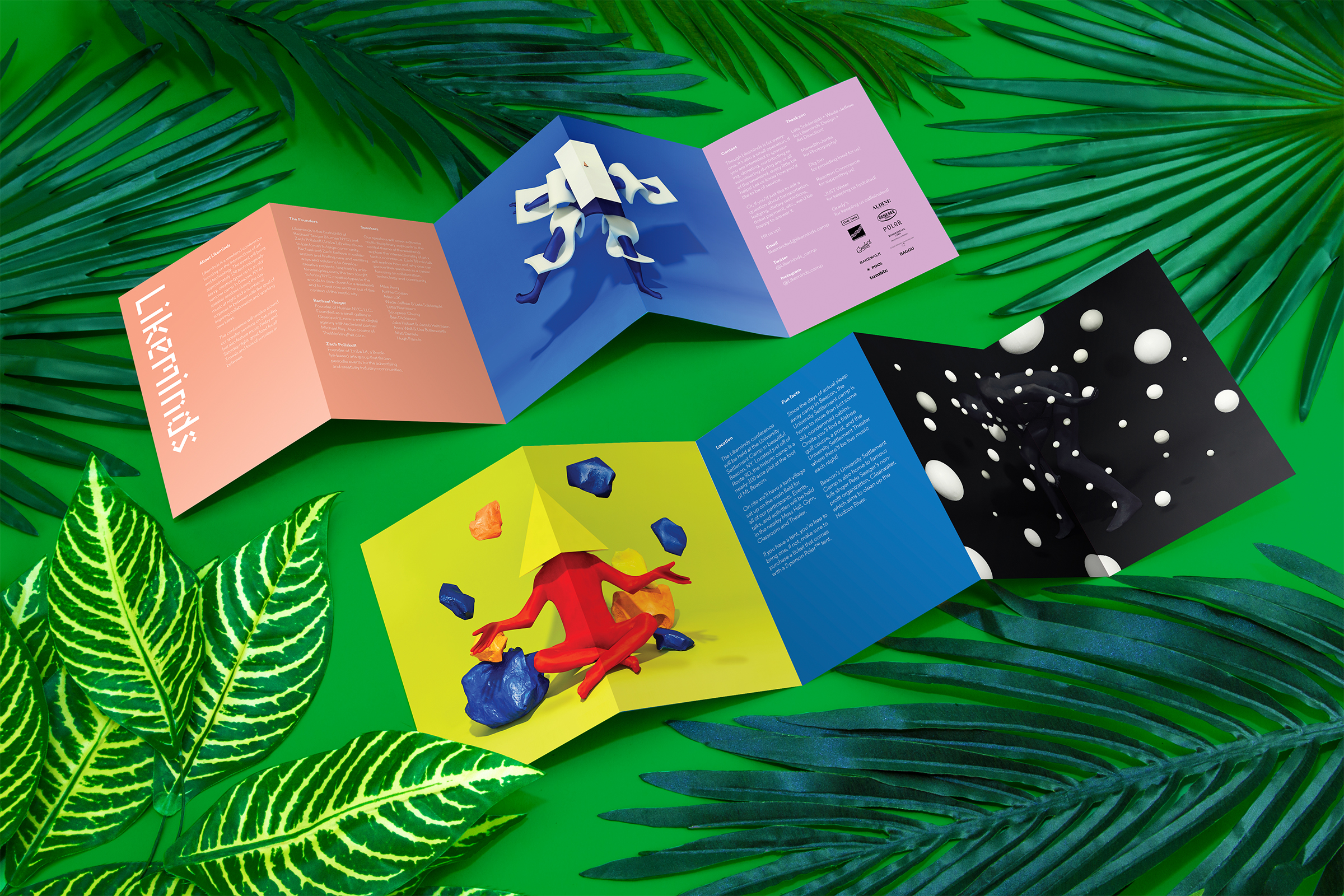
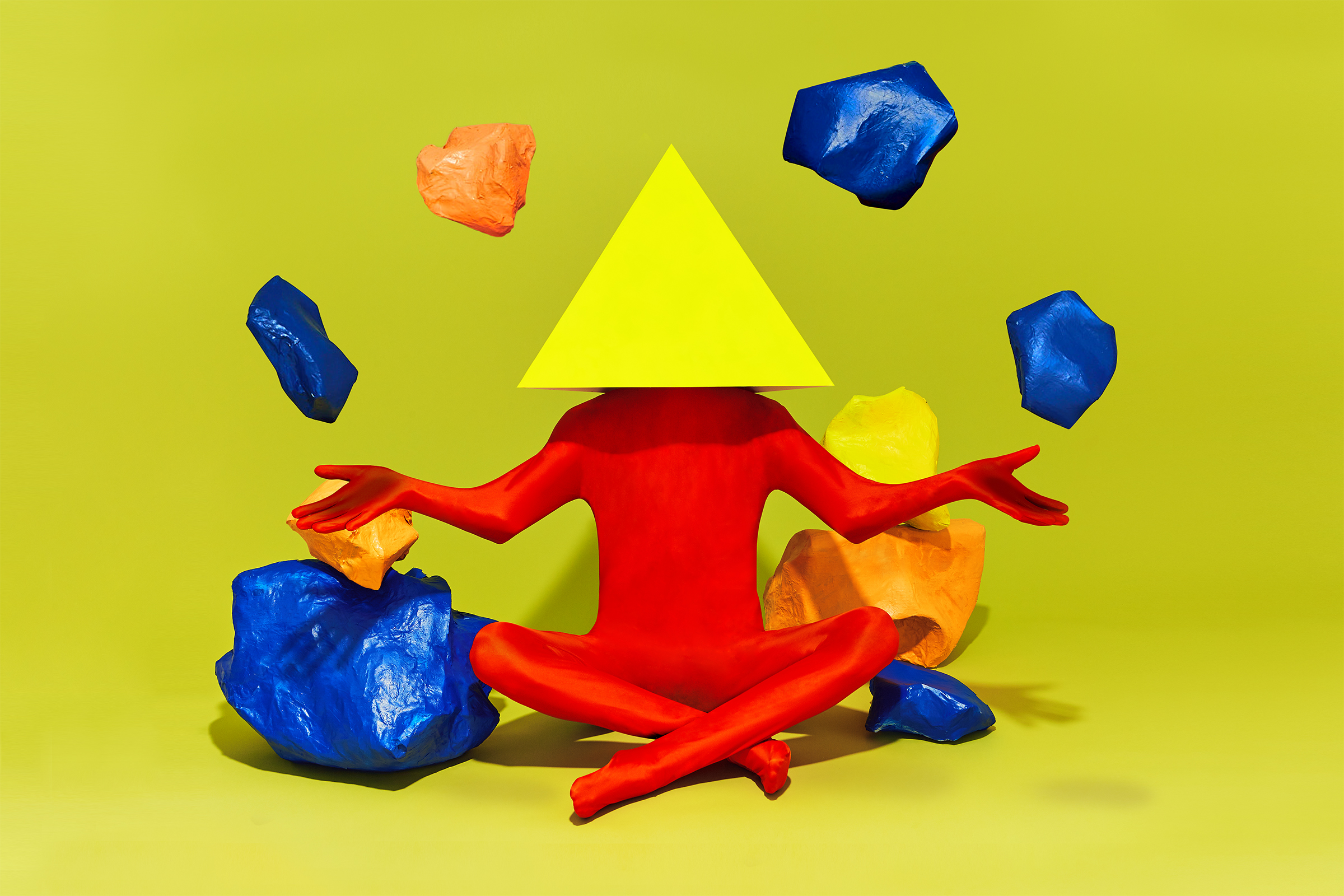
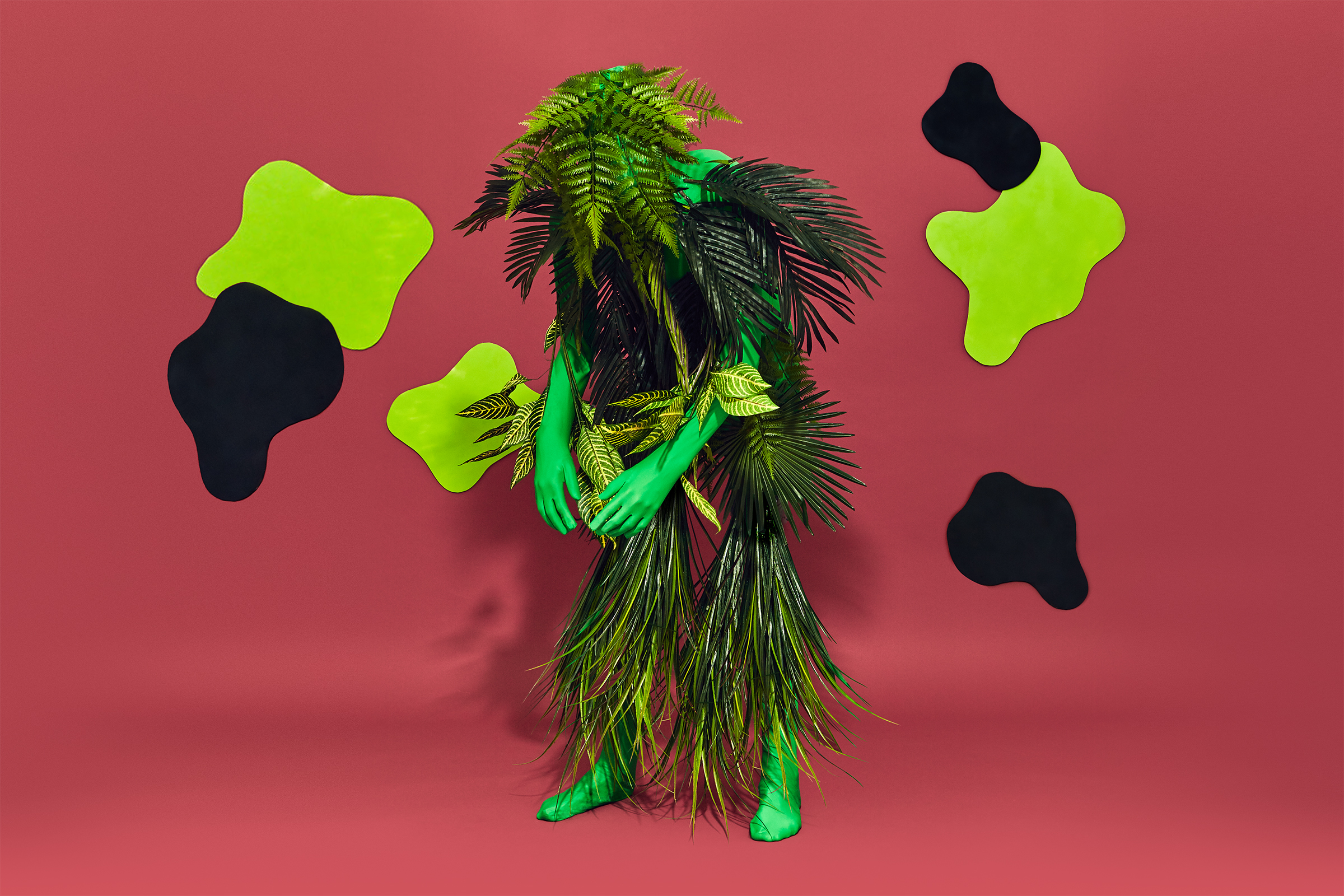
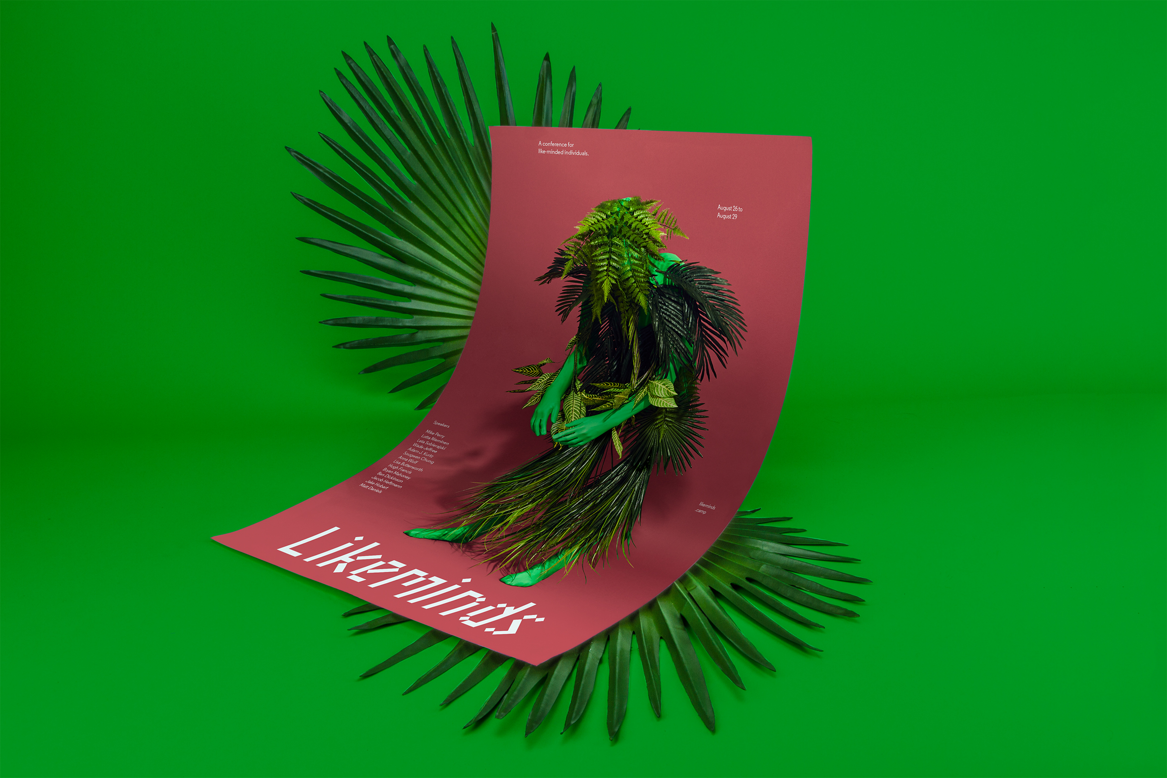
Likeminds is a weekend conference that brings together like-minded individuals: friends, creatives, contemporaries. The conference brings technologically savvy, creative-types to upstate NY with the goal of inspiring collaboration and sparking new ideas. Likeminds is the brain-child of Rachael Yaeger (Human NYC) and Zach Pollakoff (1m1w1d).
What we all have in common is an appreciation for our surroundings—we take inspiration from the world around us, but sometimes the place we call home can get overwhelming. Hence, we seek nature, as it brings us comfort, it relaxes us, and sometimes it brings out our wild side. We want to highlight the antics that nature brings out in all of us. Ultimately, we create differently, but we are like-minded in how we embrace our surroundings.
We represented the elements that speak strongest to us: air, earth, nature, night and day. These five aspects were represented as a set of scenes which sit hand-in-hand with the branding to help identify & personify Likeminds.
Services Brand Identity, Graphic Design, Art Direction, Photography, Costume
Le Turtle Restaurant


Client Le Turtle
Category Brand Identity
Year 2016
Graphic Design and Art Direction Wade Jeffree and Leta Sobierajski
Interior Photography Scottie Cameron
Web Development XXIX
Typography Development The Designer’s Foundry
Category Brand Identity
Year 2016
Graphic Design and Art Direction Wade Jeffree and Leta Sobierajski
Interior Photography Scottie Cameron
Web Development XXIX
Typography Development The Designer’s Foundry
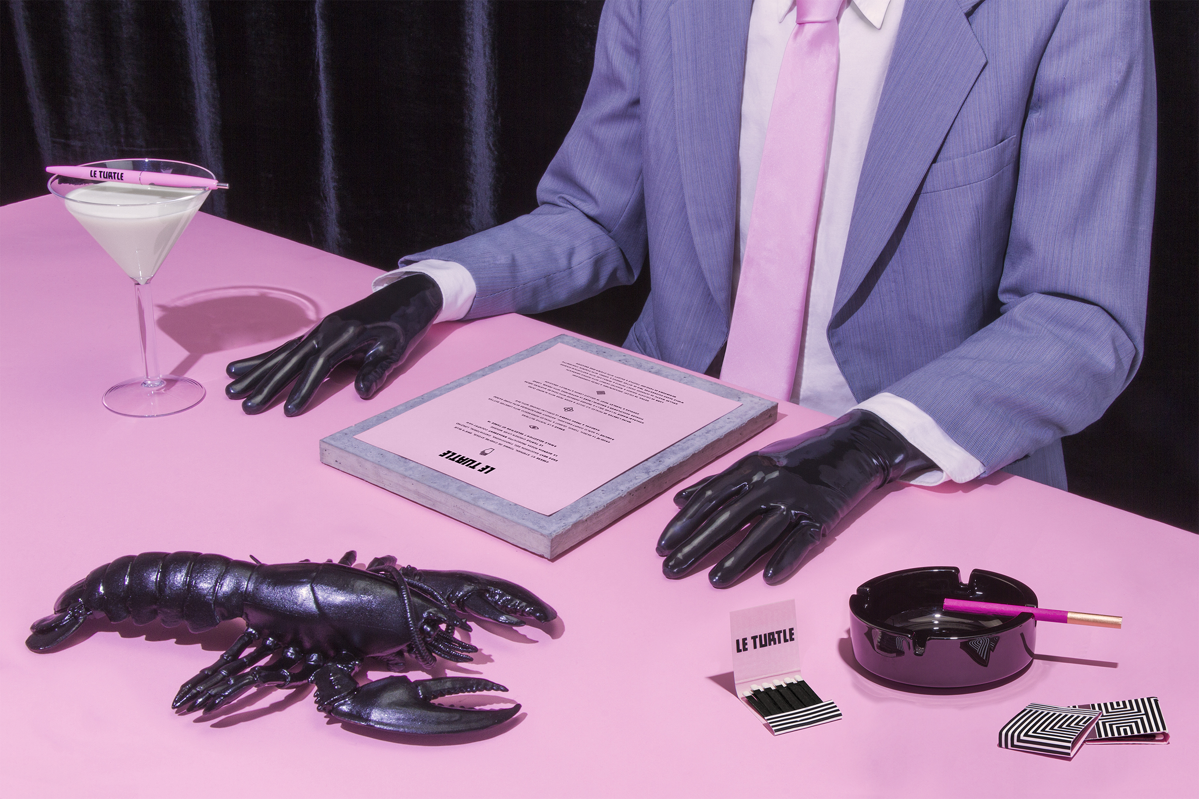
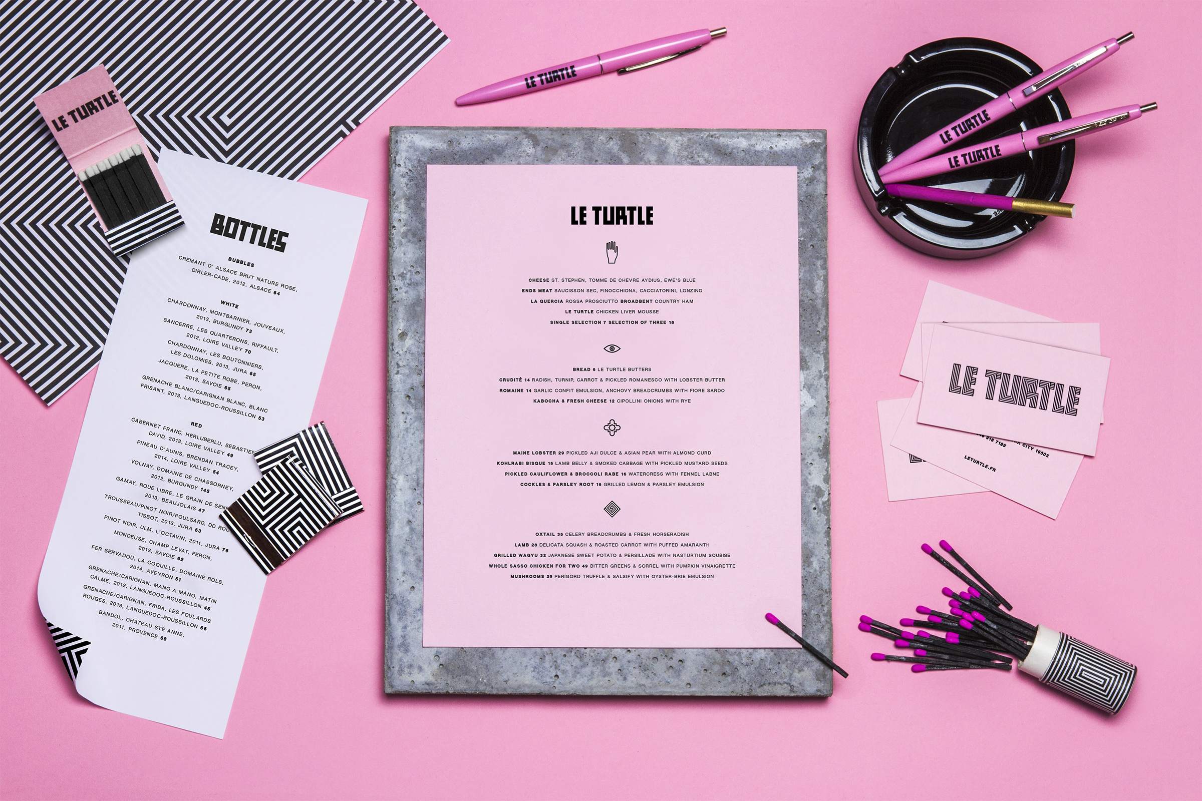
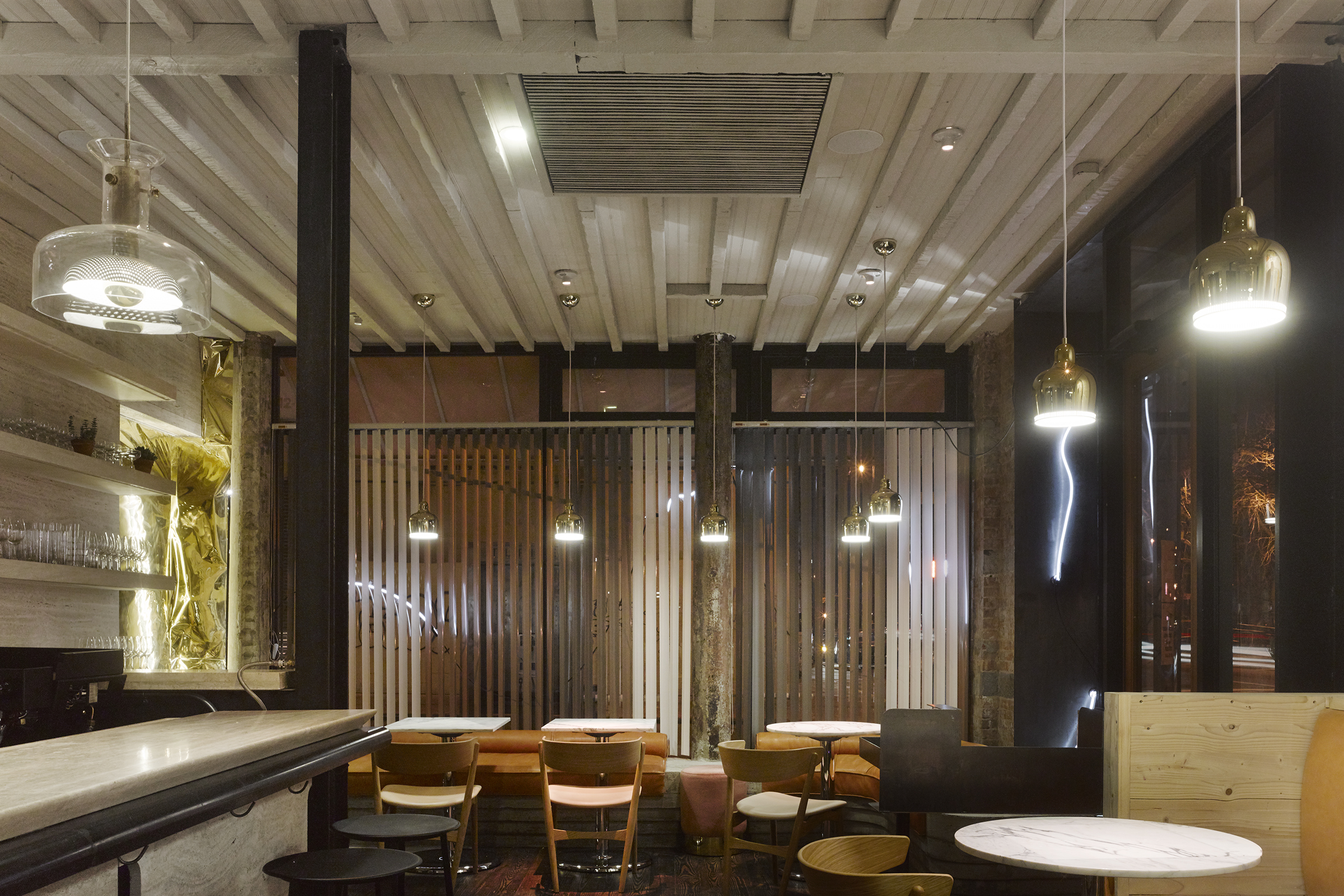
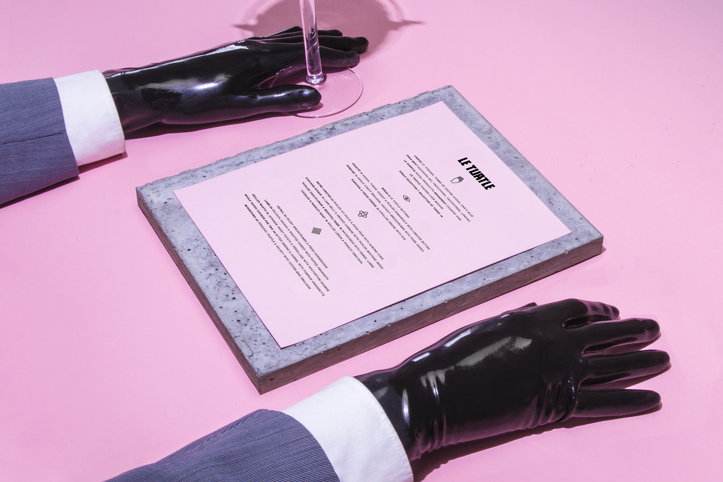
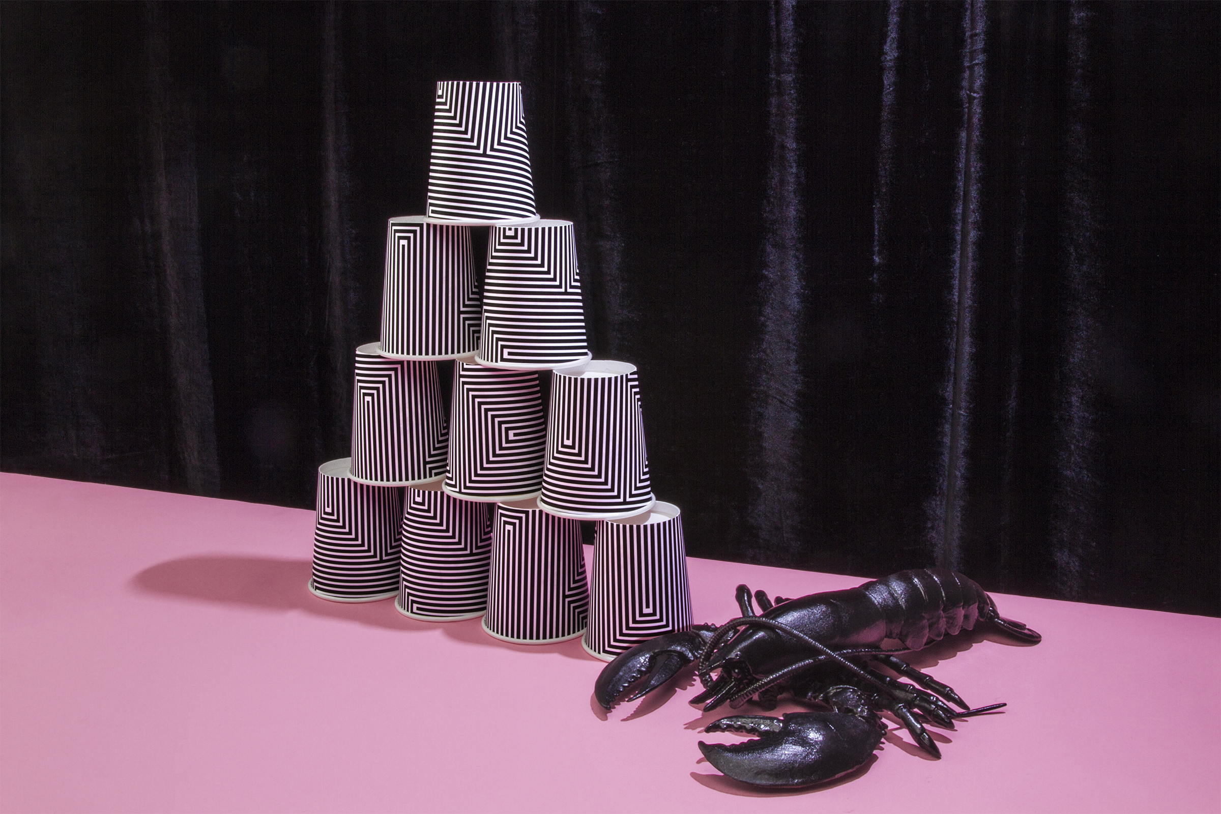
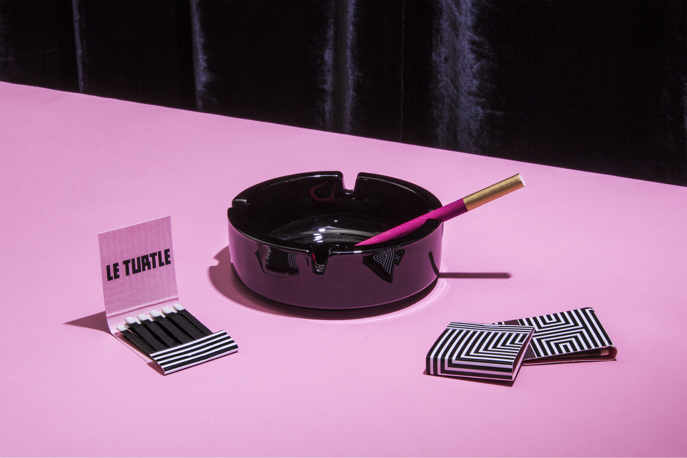
Le Turtle is a French new-wave restaurant founded by Taavo Somer of Freemans and Carlos Quirarte of The Smile. Blanca alum Greg Proechel steers the menu along with wines curated by Jessie Keifer from all corners of France.
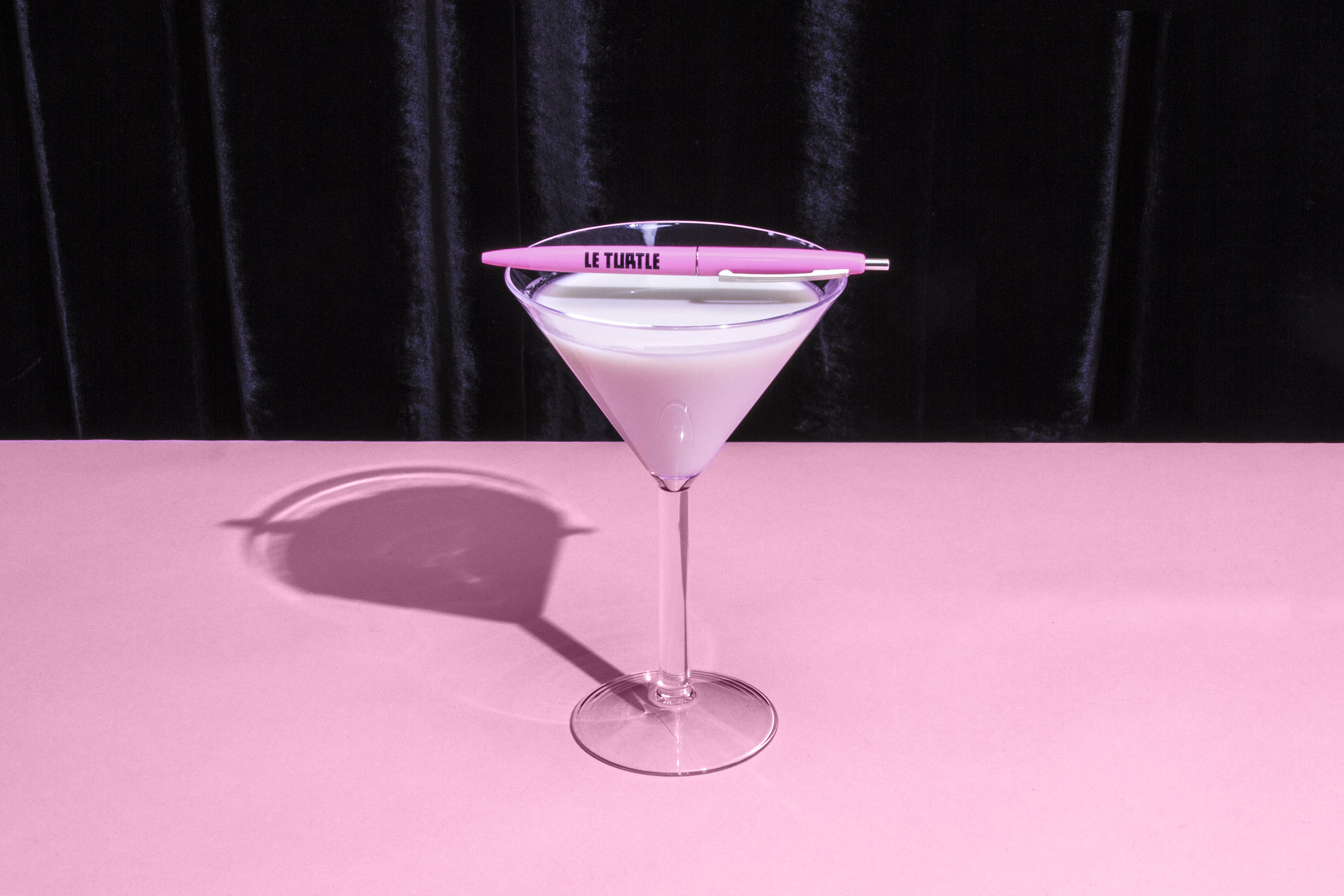
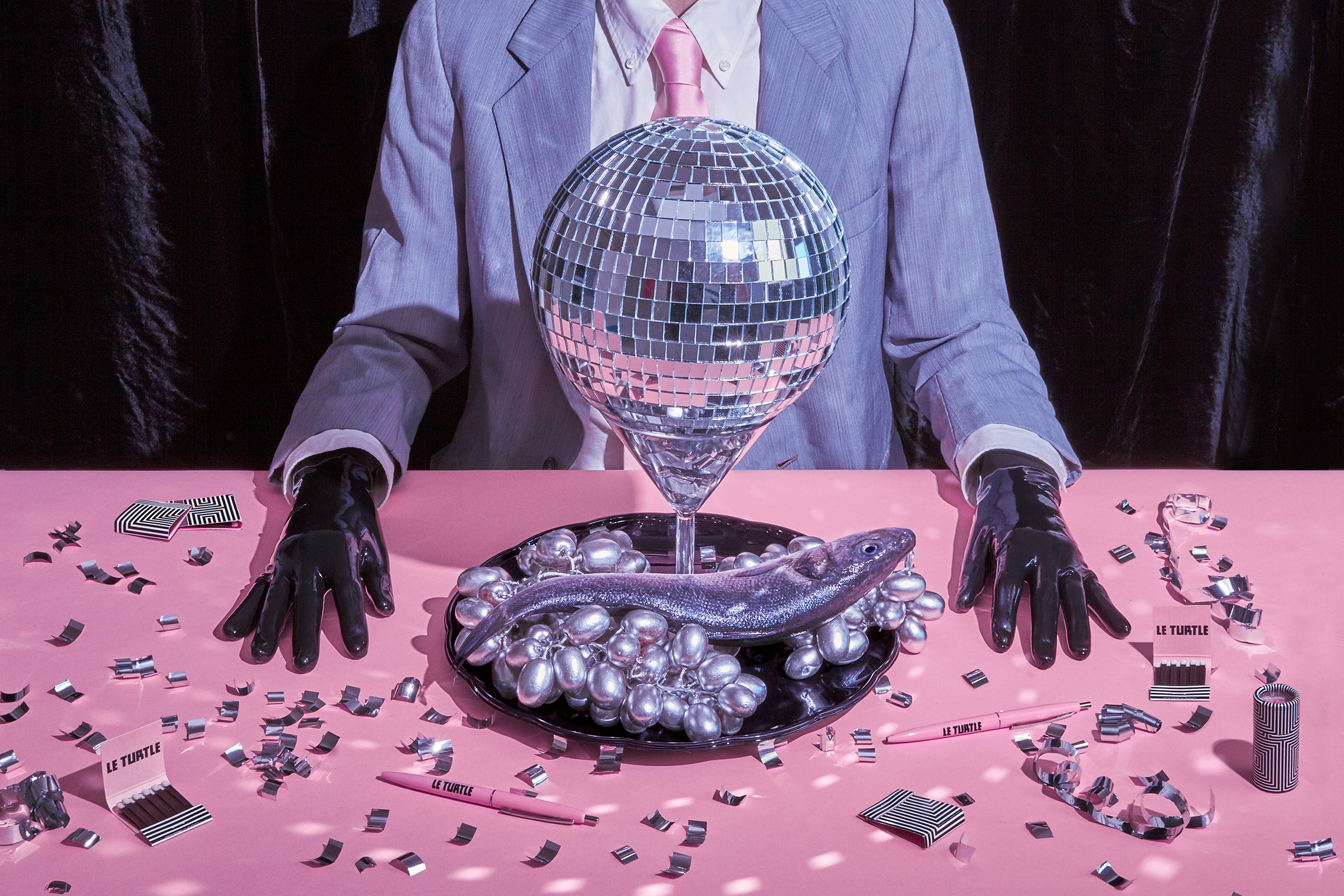
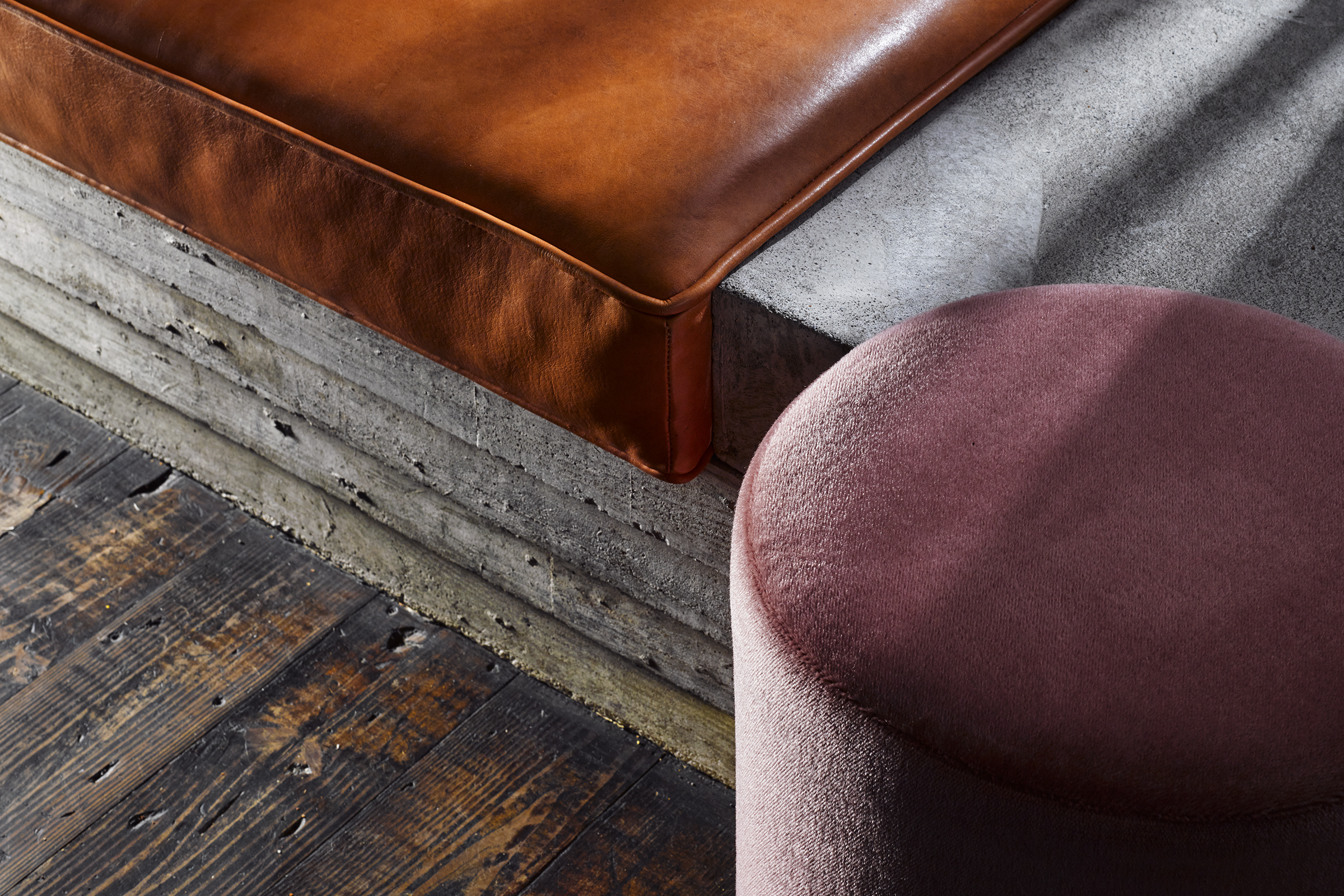
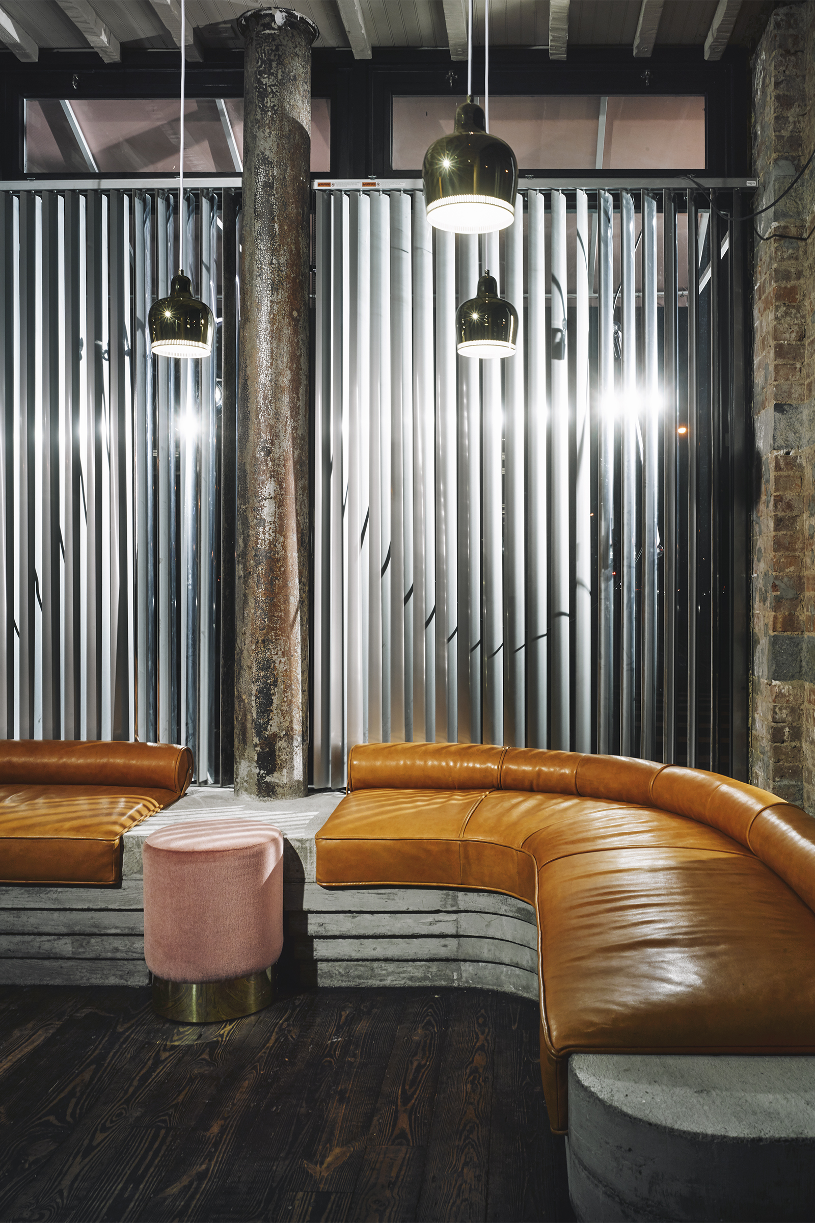
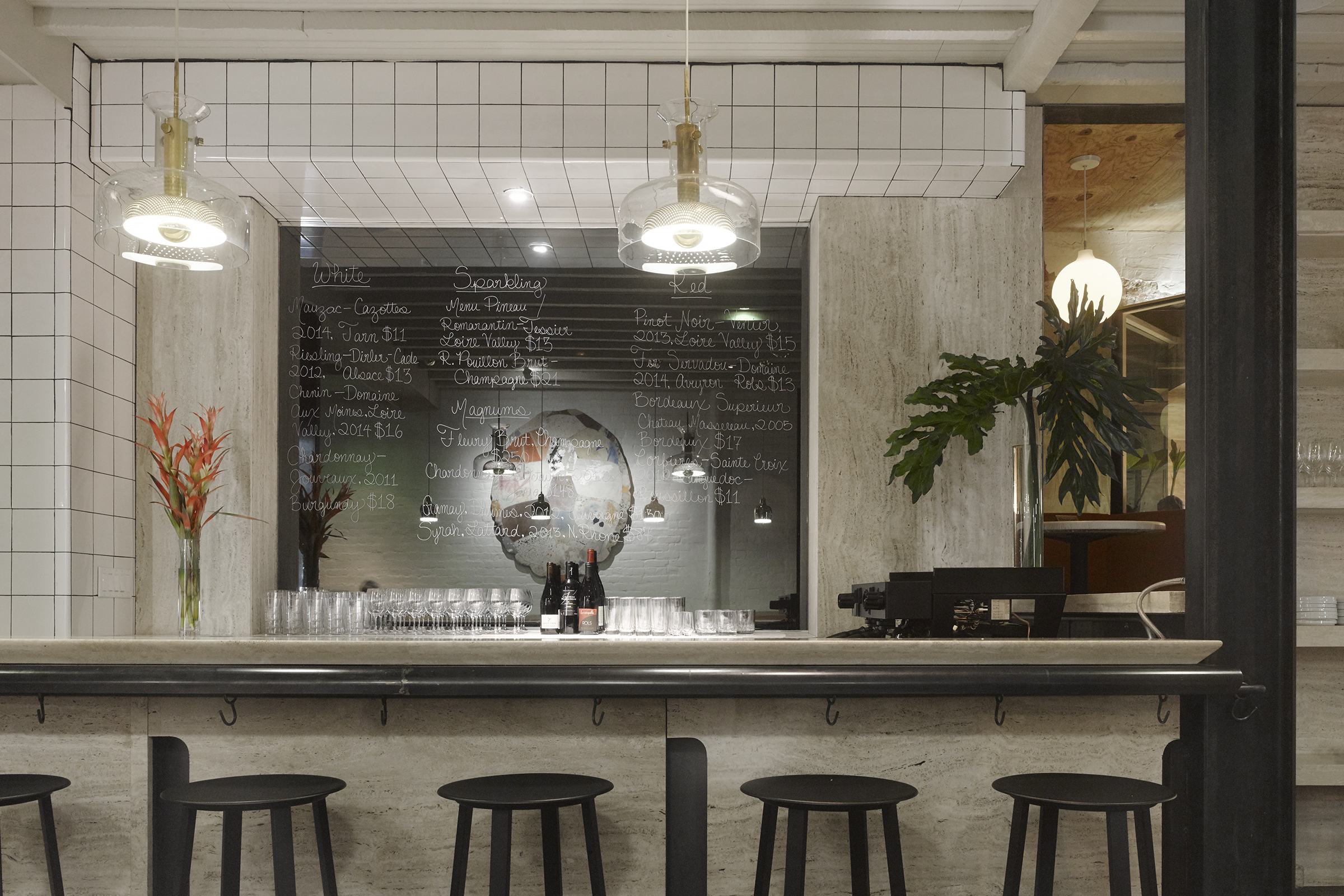
Sitting cool on the corner of Chrystie and Rivington streets, the 18-table restaurant is bathed in neon lights, draped in pink velvet and Horween leather, and set to a soundtrack of French hip-hop. The waitstaff is costumed in baggy, steel-gray prison jumpsuits which weave back and forth behind the two-way mirrors and travertine bar.
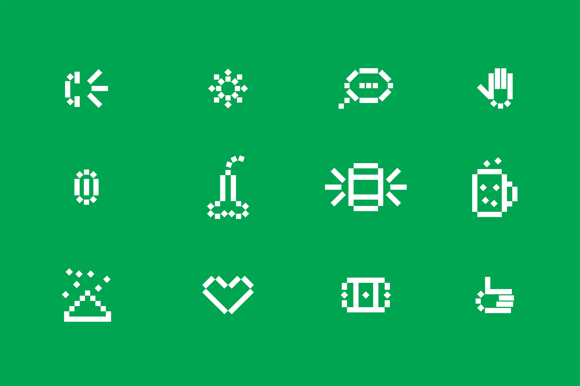
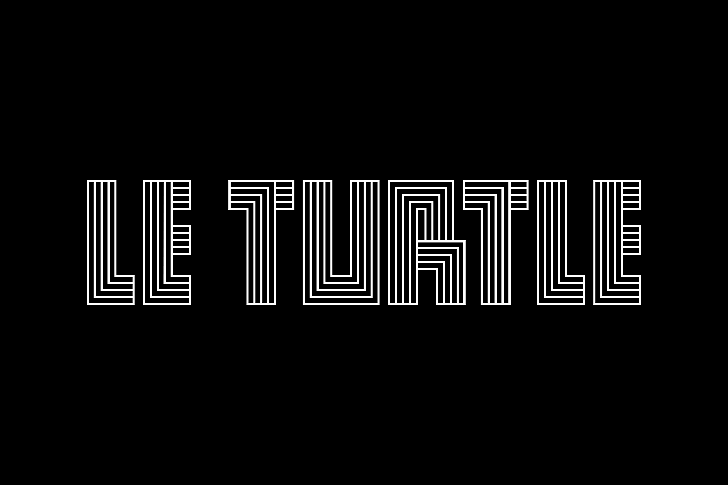
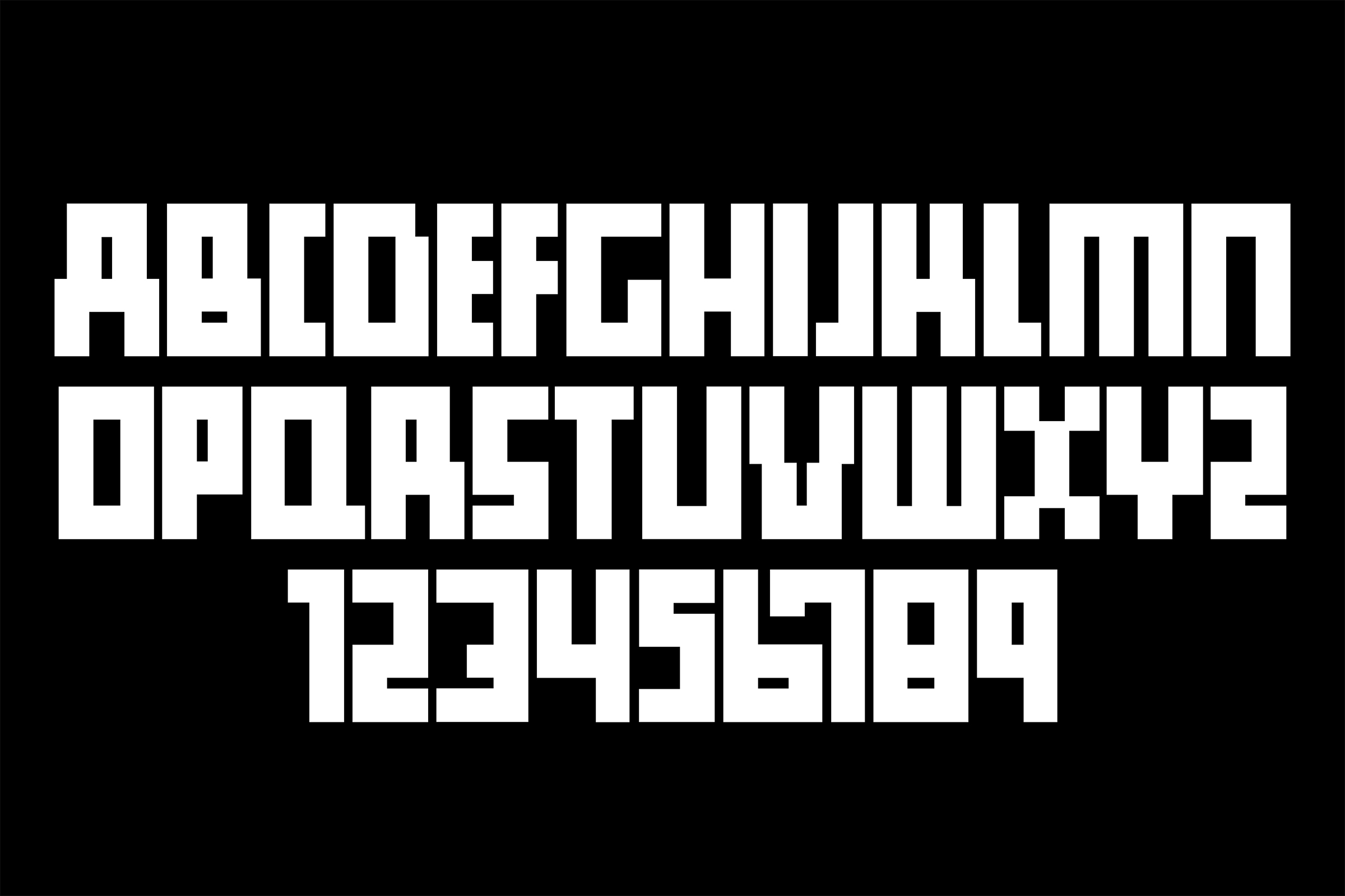
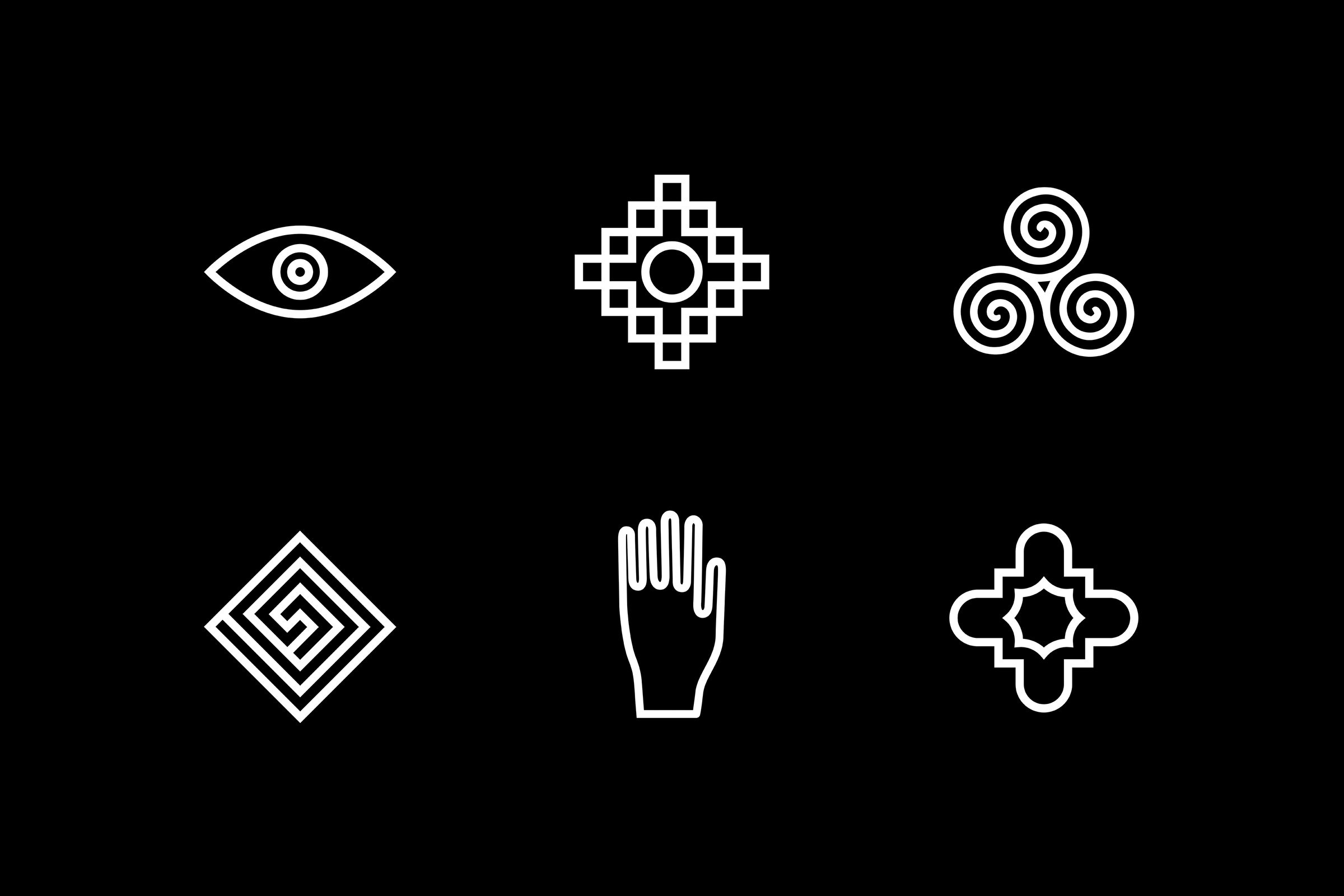
Taking notes from psychedelic symbology and visual occult, we sighted references such as The Holy Mountain by Alejandro Jodorowsky, the paintings of Victor Vasarely, the architectural notes of Carlo Scarpa, and Sol Lewitt in order to help us realize our vision for Le Turtle. We put a strong emphasis on raw materials as well as angles and curves to create a distinct brand language for the restaurant. We developed a bespoke typeface for Le Turtle to use on all printed materials as well as an iconography set for web and print.
Services Brand Identity, Graphic Design, Art Direction, Photography, Digital
Sitting cool on the corner of Chrystie and Rivington streets, the 18-table restaurant is bathed in neon lights, draped in pink velvet and Horween leather, and set to a soundtrack of French hip-hop. The waitstaff is costumed in baggy, steel-gray prison jumpsuits which weave back and forth behind the two-way mirrors and travertine bar.
Taking notes from psychedelic symbology and visual occult, we sighted references such as The Holy Mountain by Alejandro Jodorowsky, the paintings of Victor Vasarely, the architectural notes of Carlo Scarpa, and Sol Lewitt in order to help us realize our vision for Le Turtle. We put a strong emphasis on raw materials as well as angles and curves to create a distinct brand language for the restaurant. We developed a bespoke typeface for Le Turtle to use on all printed materials as well as an iconography set for web and print.
Services Brand Identity, Graphic Design, Art Direction, Photography, Digital
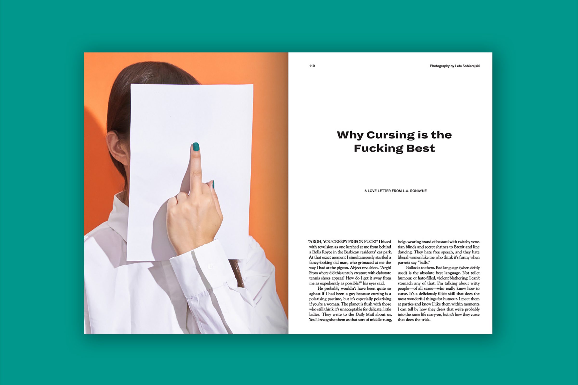
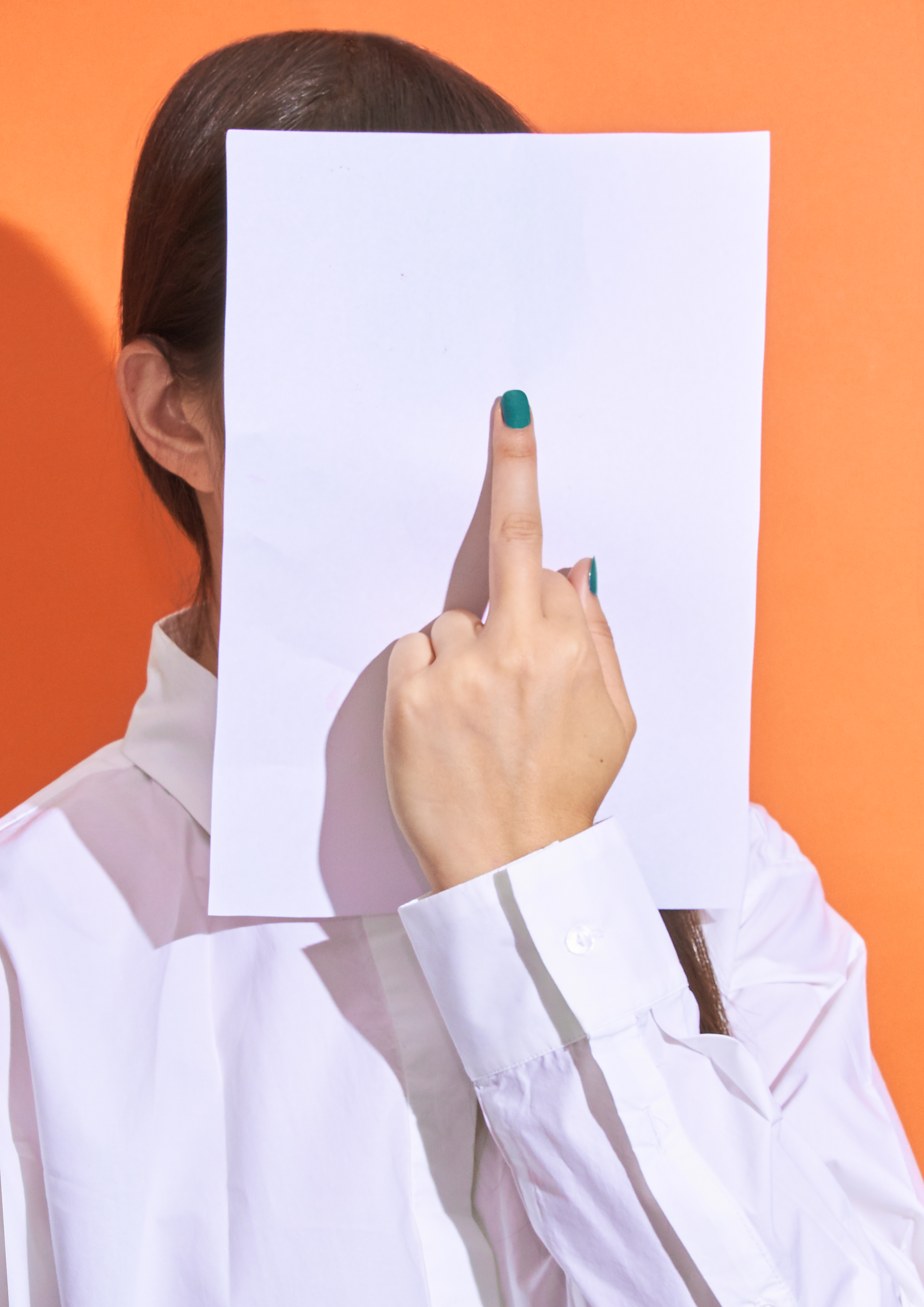
Riposte Magazine: Why Cursing is the Fucking Best
RŪH Collective
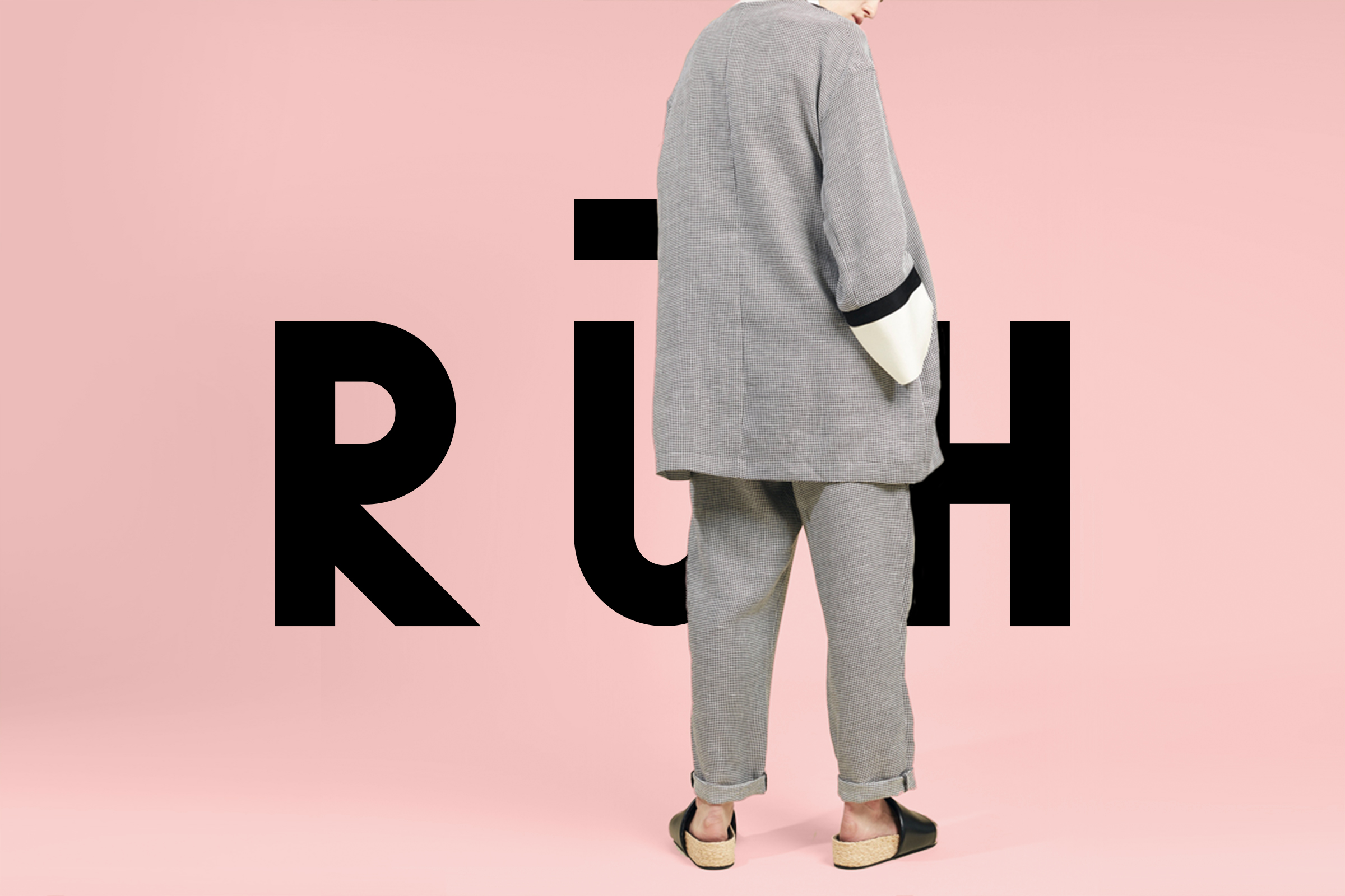
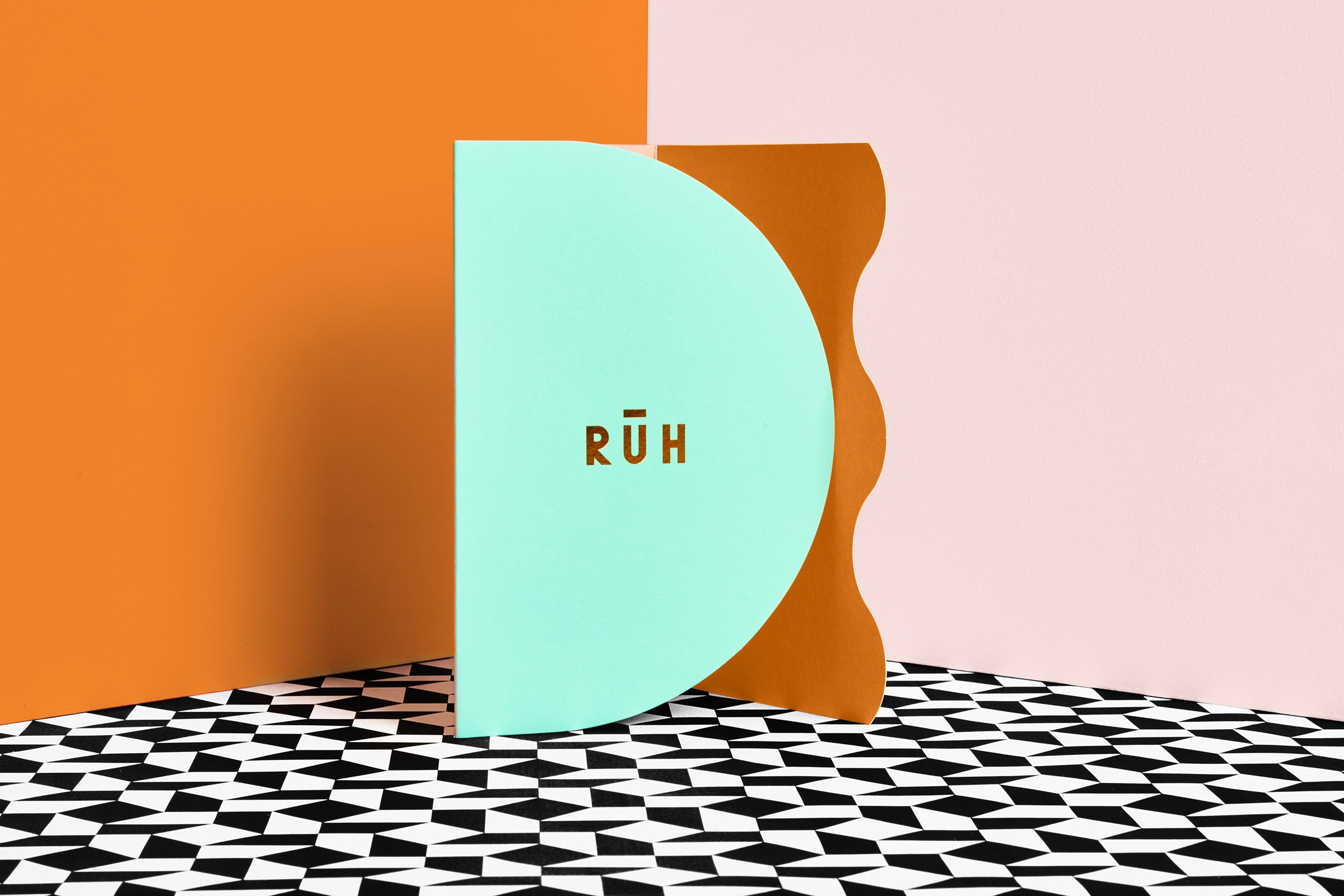
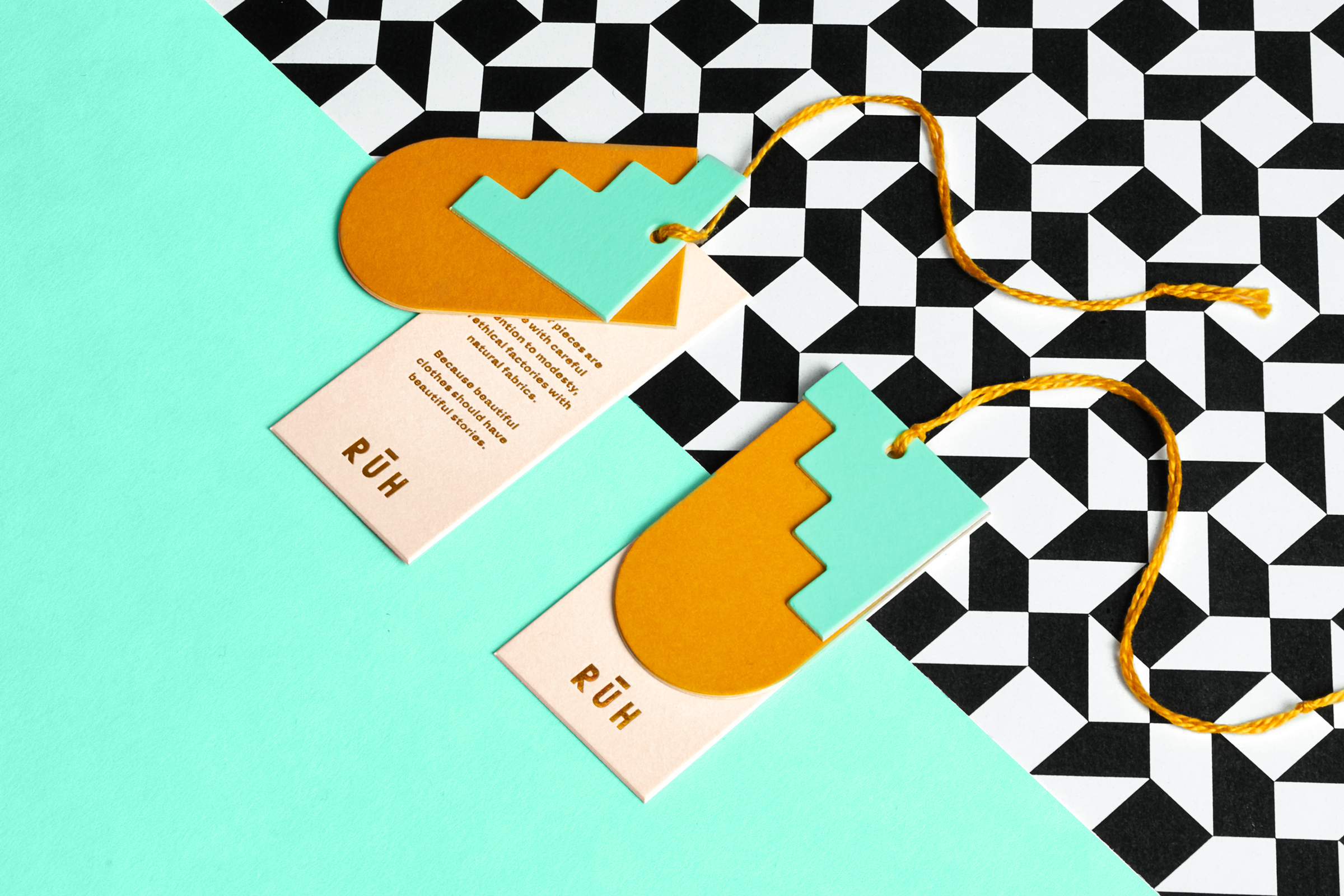
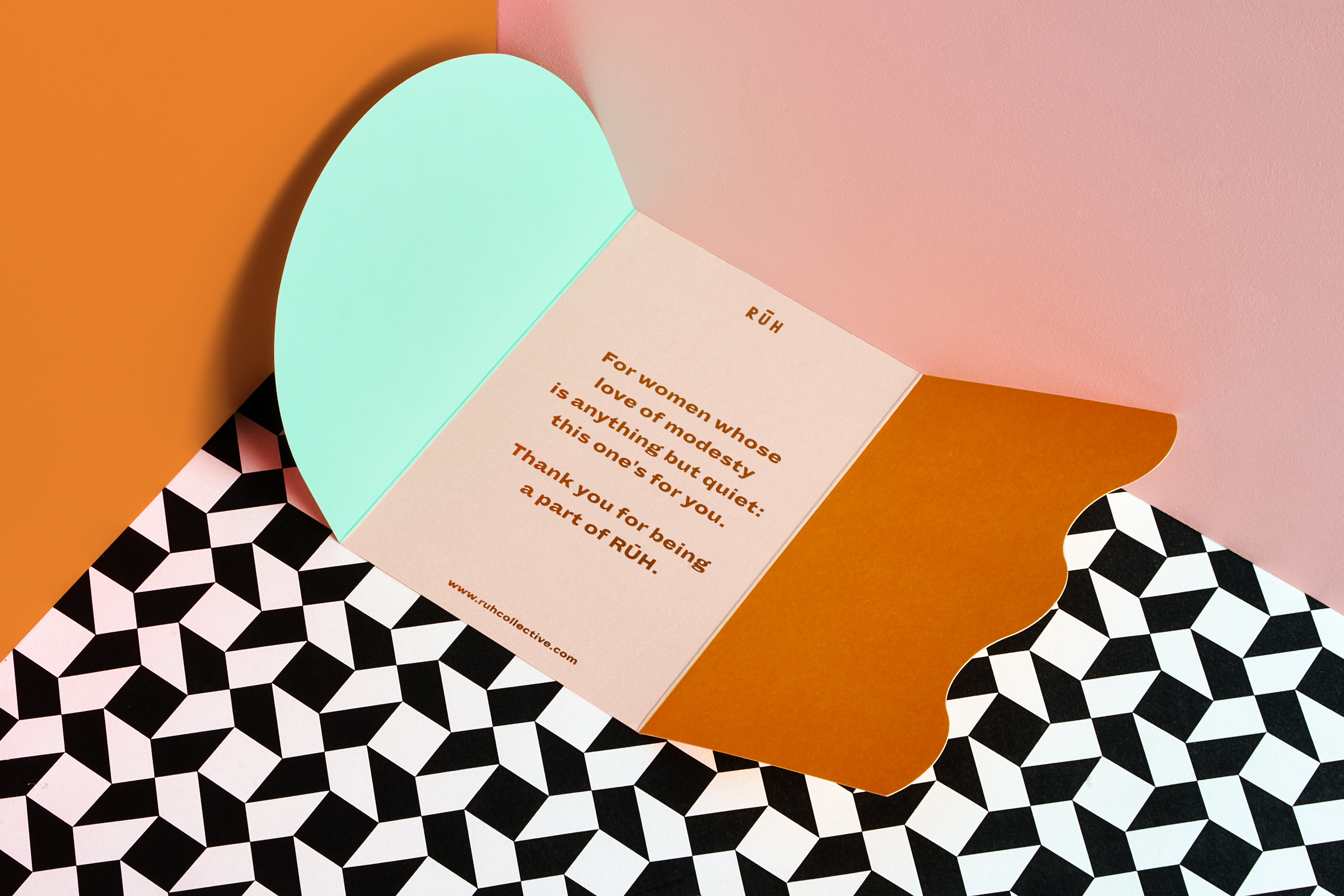
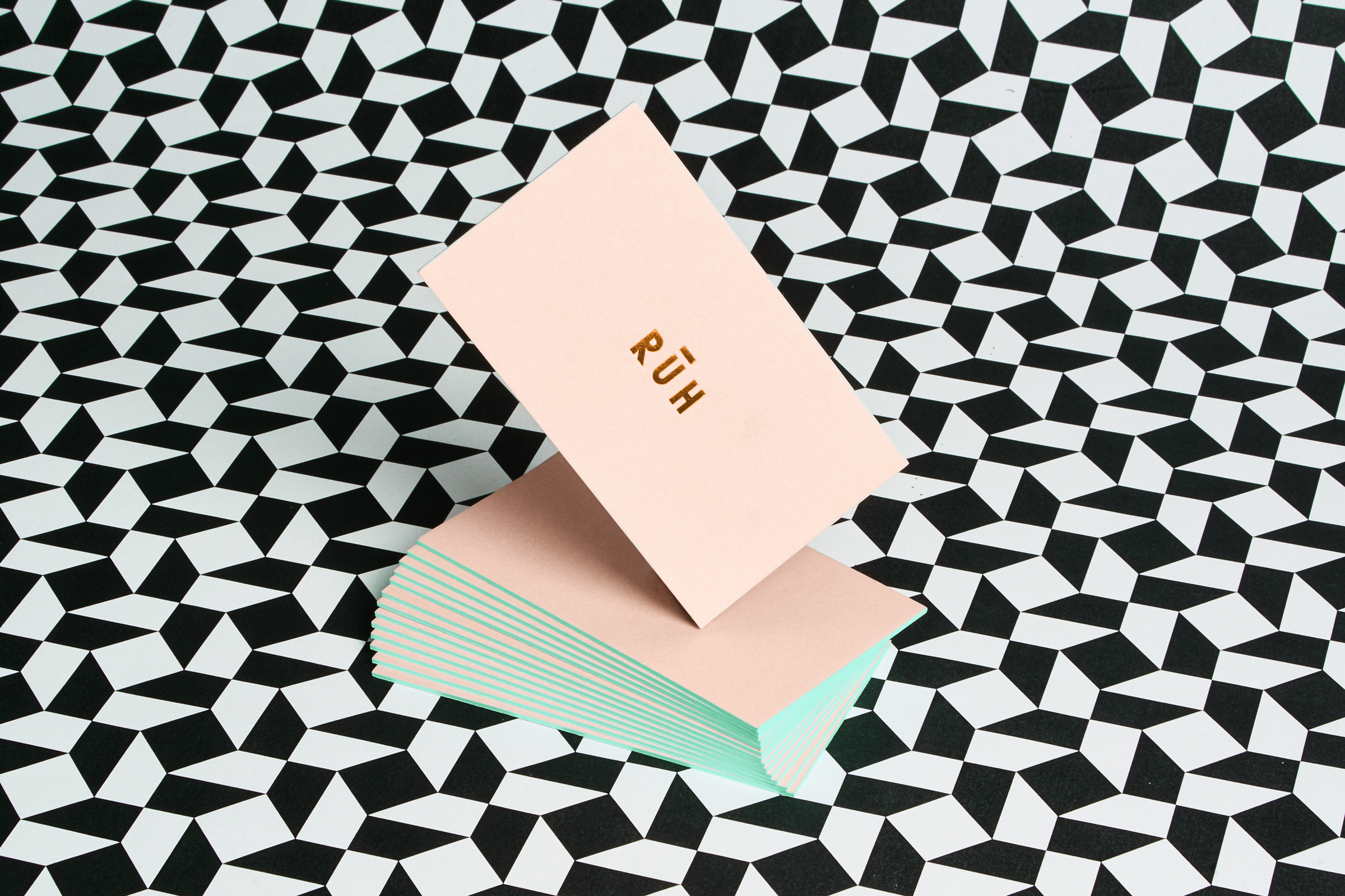
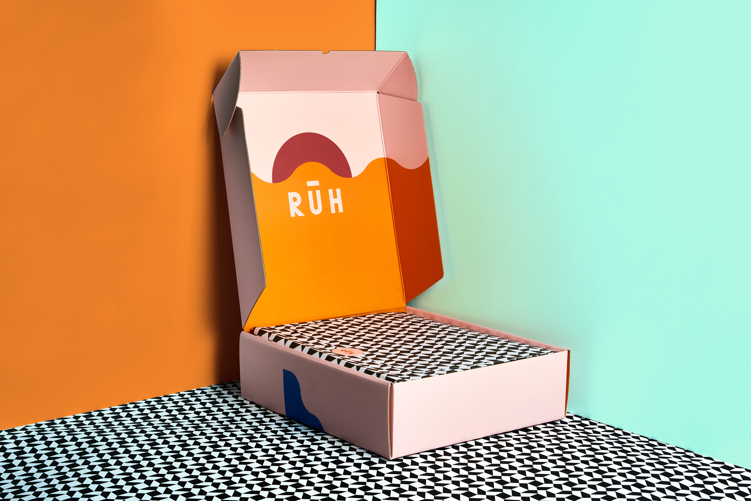
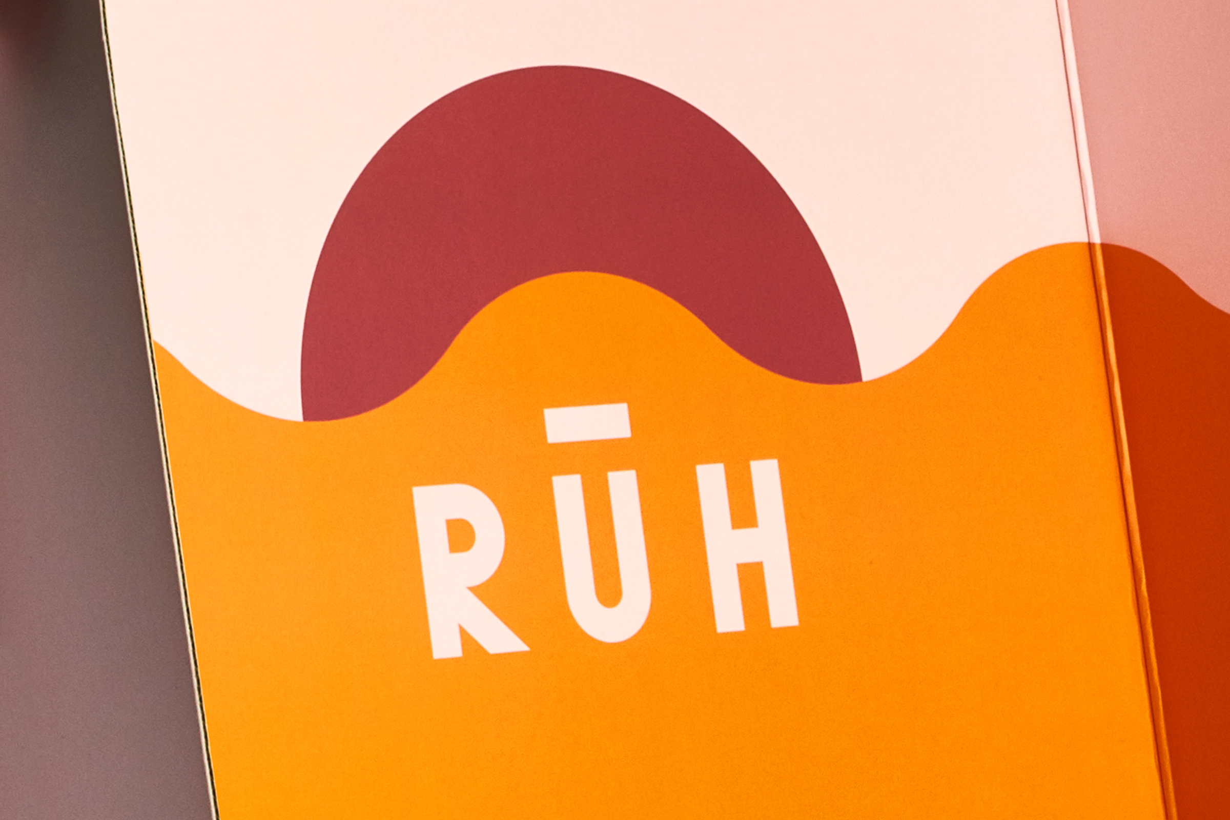


RŪH Collective is a London-based fashion brand founded by entrepreneurs and creatives from New York, London, and Istanbul. RŪH's clothing is for women whose love of modesty is anything but quiet. It is a movement based on respect, opportunity, and pure possibility.
There are five times a day that Muslims come to pray: Pre-dawn, Noon, Afternoon, Sunset, and Evening. The color palette speaks to these different times of day, each being used in varying proportions.
Heavy in illustration and color, RŪH's identity is defined by the geometric shapes which are built upon the same grid as the typographic identity. The geometry is reminiscent of old block art involving nature and sun, and finished off with a crisp copper foil.
Services Brand Identity, Graphic Design, Packaging